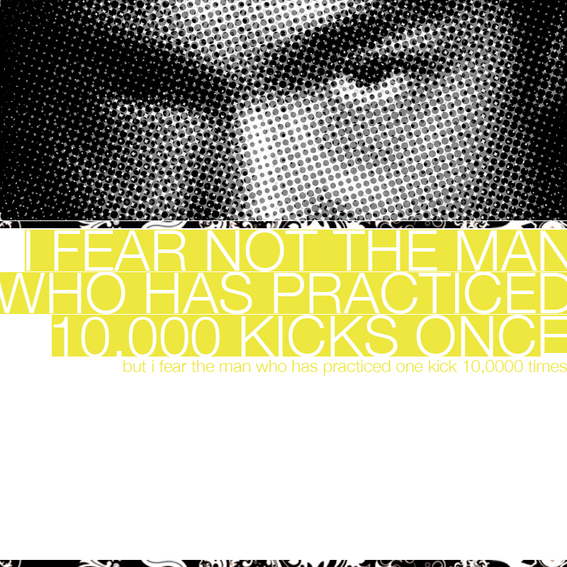
The essence of a product
If you’re a product designer, you’ve likely come across the following quote about perfection, attributed to Antoine de Saint-Exupéry.
Perfection is achieved, not when there is nothing more to add, but when there is nothing left to take away.
Designers love the adage. While simple to state, however, the idea can be a bit difficult to apply. The last part of the sentence is what sticks for me, because it centers on using reduction to find this state of perfection—the attributes that define a product’s essence. This is the crux of simplifying a design.
Reductive design is about removing what’s unnecessary and simplifying the product. It’s a philosophy in the spirit of Modern architect Ludwig Mies van der Rohe’s aphorism, “Less is more,” and Dieter Rams’ principle, “Good design is as little design as possible. Less but better.”
Chuck Pearson wrote a great article on reductive design for products. Ideas like these are axiomatic in design. Find what’s essential. Remove the parts that aren’t needed. I’ve been thinking about whether or not we are doing that in our product design work on every project. And once we ship, are we revisiting our designs over time to look at them through the lens of reductive design, and comparing that to the idea of what’s essential to the product?
Reduction in product design
I’ve read a lot about minimalism and essentialism, and as I mature as a designer, I think about the application these ideas might have to product design. Products that appear to be simple, are most likely that way because their creators pushed hard against expansion to keep the product focused on providing the most important features for the task. Deciding what to leave out is equally as important as what to put in, and I would argue can sometimes be much more difficult.
When you generate design ideas, you’re looking for the sweet spot of just enough UI and just enough features to make the user effective and efficient at accomplishing their goals or completing tasks. That sweet spot can be hard to find. I would guess that the product teams that are relentless and unforgiving in this pursuit of the essential are those that deliver those products that I love that do one thing really well.
One of the ways that we try to find that sweet spot is to hold an idea in mind that the process and output of wireframing often represents version 2. During the initial exploration of a solution, we often consider many possibilities pretty exhaustively. Then we start the hard work of making calls about what parts of the design needs to ship now—what’s essential—and look for ways to edit down and remove elements through each critique and iteration. Often times that’s where we find the optimal and most efficient ways for users to complete tasks.
I’ve also been thinking about what reductive design means for products as they mature. It’s inevitable that a product’s feature set will evolve and grow over time, particularly as you acquire more types of users. Finding the sweet spot and delivering a successful product, doesn’t mean your job is done when you first ship it. With the accretion of features, you’ll have to re-evaluate how far away the product has moved from that sweet spot.
Side note: As an expert user of the product I work on, I have found it very difficult to resist the urge to express the desire for more features over the years, but have learned to “slow my roll” in favor of remembering the product’s core, it’s target user, and its mission.
Peldi recently wrote about starting our product team on a paring down theme as we begin a new phase of the product. It’s been eye-opening and refreshing. You can spend a lot of time growing with user needs, but somewhere in the life of the product, the essence of what made it successful—it’s character and personality—may morph into something else. Added features and UI could look like more power to some, but to others it might feel like unnecessary complexity.
I think what makes our product still resonate with users is its singular focus on remaining easy to use. To those who have ideas and a need to easily get them out, we offer something of value—a way that feels as accessible as using a whiteboard or assembling building blocks like Legos or refrigerator magnet poetry. But to be sure, we’ve had to re-evaluate what’s become of the user experience over time.
How do you apply the ideas of reductive design over the lifetime of the product, as it evolves to meet the needs of more customers? I think the answer lies in capturing the essence of your product, whether it be in a mission statement, manifesto, or some other expression of the core purpose of the product. Then continually revisit that statement and use reduction to keep that core character alive.
Reduction doesn’t only mean removal
Another thought that occurs to me is that reduction doesn’t only mean removing features. Reduction also applies to reducing complexity. It could mean re-envisioning the form or behavior of a feature so that it works more efficiently, uses fewer steps.
Consider this description of reductive art as a style that “emphasizes clarity, simplification, reduced means, reduction of form, streamlined composition, primary shapes, and restricted color. … It is also characterized by the use of plain-spoken materials, precise craftsmanship and intellectual rigor.”
The idea is consistent with minimalism in art. Applying the concept to products, however, must also consider how those attributes affect use and usability. And that’s where reduction becomes a powerful tool—aesthetic choices can have an impact on the user in terms of clarity and efficiency. The surface, when designed in a way that balances ease of use with these ideas, provides an experience worthy of the user’s time.
In “The Art of Reductive Design,” Chuck Pearson writes about how reductive design becomes a factor for their web design work.
“[W]e have to analyze and assess exactly what the goals of the site are and then get rid of everything that competes with or stands in the way of those goals. As users, we have limited attention. We can only focus on one thing at a time. Every time an extra element is added into a website or app, whether it’s additional navigational elements, bold colors, motion, sound, etc., it pulls the user’s attention away from something else.”
Having a streamlined product is a differentiating factor in a market flooded with complex and complicated competitors.
Here’s a very interesting example of reductive design in an industrial design context. The Ford Maverick is a very different pickup truck. It lives in a space between SUVs like the Ford Bronco and large body-on-frame work trucks like the F150. It’s targeted at a market that probably will use it for outdoor recreation and everyday chores more than for heavy-duty hauling and construction.
They talk about reductive design as guiding principle for shaping the truck’s interior. There’s an emphasis on sustainability and savings to customer. But there’s also thought put into studying how drivers want to use their vehicle and designing the interior features. Take for instance their design of the door handle and door storage space to hold variable sizes of water bottles (32 oz. Nalgene owners rejoice!) rather than only doing the industry’s default sizing—cup holders suitable for to go cups and disposable water bottles. This is using reduction as a guiding principle by crafting a differently shaped handle that exposes hardware, considers real-world use, and does more with less.
This is really cool, but Ford goes beyond this one example by making their product hackable for DIYers. One example of this is with their “fit slot” that allows owners to 3D print custom items that slot into the back of the console system. No doubt, most users won’t take advantage of this, but the idea of the slot is a clever way to add possibility for the power users without requiring it for the default experience. Another example is to that they provide a QR code that links to recipes to DIY different solutions for the truck bed.
Staying vigilant
The ideas wrapped up in reductive design demonstrate the timelessness of the truisms from Mies van der Rohe (less is more), Buckminster Fuller (do more with less), Dieter Rams (less, but better), Kelly Johnson and maybe your dad (keep it simple, stupid). So many great products have reduction, and the delivery of what’s essential to user goals as a core attribute and contributor to their success. It’s a difficult principle to live by, particularly as your product becomes successful and you are met with demands for it to do more.
If I can leave you with one thought about reduction in product design, it’s this. Remember that there is a core or essence to your product—a state where your product has all of essential attributes to help users solve a problem. Invest time in discovering this core and use reduction to find it. Iteratively evaluate your product against this idea of it’s essence. And once you’ve found it, remember to stay vigilant in keeping true to it.