It's not terribly newsworthy, but Facebook's design team announced that they've stopped rounding corners on all elements. I noticed, however, that they kept the slight (3px?) rounding of names in the To: field of the messaging section. That somehow feels like a natural place for an exception to rounding corners for some reason. You know, so you don't get impaled when backspacing in the field. Kidding. This is a quote from their announcement.
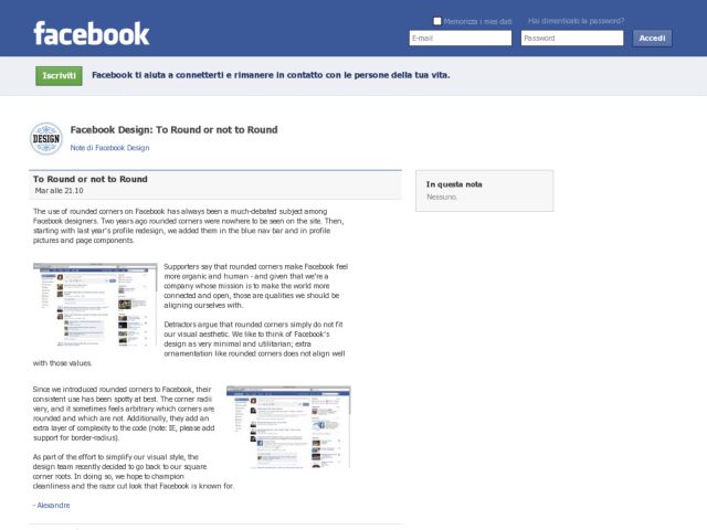
Since we introduced rounded corners to Facebook, their consistent use has been spotty at best. The corner radii vary, and it sometimes feels arbitrary which corners are rounded and which are not. Additionally, they add an extra layer of complexity to the code (note: IE, please add support for border-radius).
As part of the effort to simplify our visual style, the design team recently decided to go back to our square corner roots. In doing so, we hope to champion cleanliness and the razor cut look that Facebook is known for.
See. It's a "razor cut" look. Pardon me while I roll my eyes loudly. Design-wise, it does have the boxy Facebook feeling of the original, without the muddy bluish gray backgrounds in the sidebars. It's never been known for being beautiful, but I like that they're being decisive about their identity and settling on a consistent style.