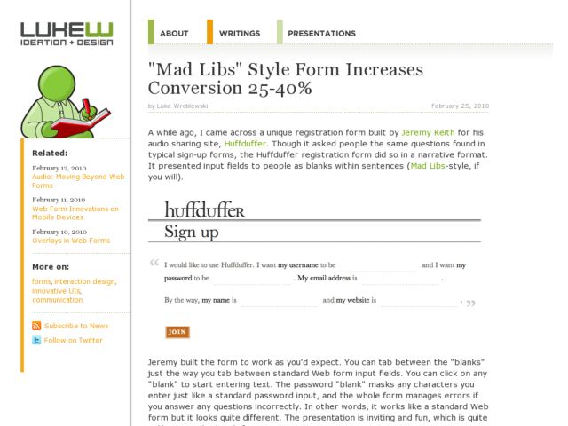
Luke Wroblewski reports on A-B tests performed by Ron Kurti and the team at Vast.com, who note that Mad Libs style forms increased conversion across the board by 25-40%. Read more and see the before/after screenshots at LukeW.
Update:
Shortly after posting this, David Kaneda pointed out his post, in which he observes that there is quite a bit more to that Kelly Blue Book form redesign than just switching from vertically arranged fields to inline fields. The increase in conversion can't necessarily be attributed to one thing in this case since there are many other variables from A to B.
Patrick McKenzie noted that you should test with your own users. He experimented with inline form fields in his A-B test and found that conversion rates decreased. His form design, however, was a bit harder to parse than the KBB example. Some argue that the agenda there seemed to be to disprove the effectiveness of the mad libs style.
There's even more discussion about issues with the A-B test at Hacker News. So this looks like one to implement with care and be sure to observe the results.
For what it's worth, I find short inline forms to be effective, and useful given space constraints. The login form on this site, for instance works within a short strip of real estate. It's not really the same as the longer forms--the mad libs style seems to take about a paragraph rather than sentence--but it's similar in that it departs from the typical quick parsing of a skimmable columnar layout to prose style reading.
