I find inspiration in the literature that examines games and play as factors in creating delightful and engaging experiences. I like to think of how this applies to products outside of the video gaming industry. I've had Thomas Malone's 1981 paper, "Heuristics for Designing Enjoyable Interfaces: Lessons from computer games" on my desk for a while. I finally got around to reading it and found some interesting ideas that resonated with me.
The paper asks why users find games captivating and proposes guidelines for designing enjoyable systems. What I found relevant for interface design are Malone's observations about the experience with toys versus tools, and how to incorporate elements of game play to make tools more enjoyable.
One of the distinctions he makes is that when using tools, their interfaces tend to become virtually invisible, to allow the user to focus attention on tasks that satisfy their external needs and goals.
I don't think all tools become invisible, but well-designed, efficient interfaces for business software tend to feel this way. I also think of it this way—I don't go to the library to experience the library, I go to satisfy a need external to that physical place. The collection of the building, its contents, and it's staff are the tool, and more importantly they are simply a means to an end. The same is true of research databases or search engines. Most business software is focussed on fulfilling needs and goals, and the ones that I've used that feel efficient tend to have interfaces that fall away so I can focus on tasks.
We're using tools during large portions of our work day, and to some extent, for power users, their utility sometimes makes them boring, and we seek out ways to find challenges using them. I found this passage particularly relevant to me.
In a sense, a good game is intentionally made difficult to play, but a tool should be made as easy as possible to use. This distinction helps explain why some users of complex system may enjoy mastering tools that are extremely difficult to use. To the extent that these users are treating the systems as toys rather than tools, the difficulty increases the challenge and therefore the pleasure of using the systems.
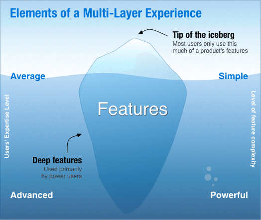
Interesting idea, although the conflict of simple versus complex presents a challenge. With tools, simple features are great for satisfying that 80% of users that need efficiency, but the 20% of power users can probably stand to go beyond that simpler experience. For them, the challenge is to find ways to unlock the hidden features beneath the iceberg.
I thought of it as an iceberg representing features (excuse the cliche metaphor). The tip represents defaults and simple features for the majority of average users, and the larger mass below the surface represents power users and the often hidden, advanced features they use.
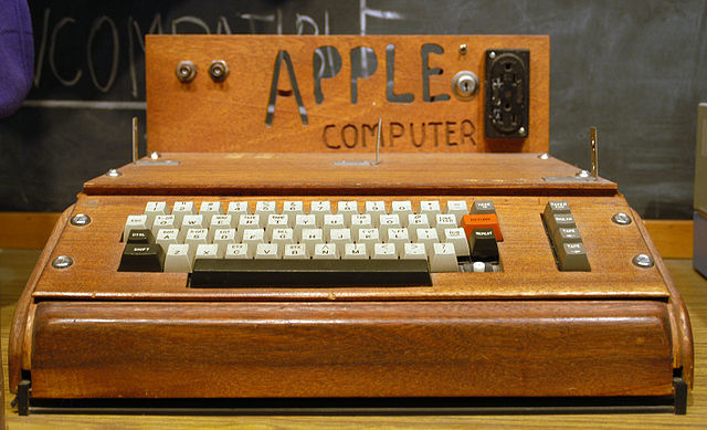
The conflict really has to do with power users. They want to push the tool to do more, they want to do advanced things. What Malone proposes in this case is to build in a progression of increasingly complex levels, and the analog in the business tools world would be access to advanced features, whether they be built into the interface itself, or require expert-level expertise to access those features. Have you ever looked at the insanity of an MS Excel spreadsheet loaded with macros? That's the kind of analog we're talking about. Or in a SaaS environment, it's an API that gives access to data.
There are simpler examples from our world. Some IAs use these kinds of expert-level skills to get access to data from websites to come up with information graphics that help us visualize that information when wrestling with server log analysis or content inventories. I did a lot of this with tools like Graphviz in the past. In traditional design tools, it could mean pushing an advanced feature in graphics software to do things beyond what they were intended for. I'm thinking of things like using JavaScript and Scriptographer in Illustrator, in this case.
Malone talks about building multi-layered systems in games in order to push advanced users to become more engaged and sustain their use with the game.
[A] multi-layered system could not only help resolve the trade-off between simplicity and power. It could also enhance the challenge of using the system. Users could derive self-esteem and pleasure from successively mastering more and more advanced layers of the system, and this kind of pleasure might be more frequent if the layers are made an explicit part of the system.
What he's talking about is common in games—providing an ecosystem that supports leveling up with the purpose of providing incentive and reward via building up expertise and engagement.
This reminds me of what Kathy Sierra talks about in her talks on creating awesome users. Experiences that progressively introduce and teach users about advanced features have a better chance of sustaining engagement with them. This is something we all want in our products.
I love the idea behind this. It becomes our responsibility as interface designers to know how to identify the tip of the iceberg to provide the simple defaults, but simplicity isn't all. We might keep the majority of our users working with the obvious features, but we want to provide the conditions that will let them become expert, and over time keep them feeling continually challenged and satisfied. Our challenge comes in knowing how to push the iceberg up, or teach the user how to swim deeper below the surface.
http://dl.acm.org/citation.cfm?id=800049.801756