Yelp CEO Jeremy Stoppelman talks about the company’s launch of Monocle, which started as an easter egg coded by an intern.
Via @lukewdesign
http://www.augmentedrealityblog.eu/2010/04/02/ceo-yelp-is-amazed-by-results-of-monocle/
Yelp CEO Jeremy Stoppelman talks about the company’s launch of Monocle, which started as an easter egg coded by an intern.
Via @lukewdesign
http://www.augmentedrealityblog.eu/2010/04/02/ceo-yelp-is-amazed-by-results-of-monocle/
I saw Dave Gray demonstrate his visual alphabet at SXSWi last year. If you haven't seen him demonstrate this, you might want to watch this video now. In the video he illustrates for us how sketching is just combining forms and lines, and all you really need to be able to come up with pictures is to see and use these basic shapes.
See also Dave's Basic Rules for Napkin Sketching after you've seen the above.
I remember drawing as a kid, feeling frustrated sometimes because I couldn't make things look the way they do in real life. I didn't really understand representational drawing until I started painting. In examining volumes, I was able to find a more basic understanding of the 2 dimensional shapes, and began drawing with ease. But it all came together when I took a Manga drawing class and started drawing characters that I really saw everything in this world of 2d and 3d shapes and polygons.
Drawing representationally shouldn't be the goal in sketching. It should be capturing an idea with rough, basic shapes. I think wanting to draw representational renderings is what held me back so much when I was younger, but embracing the basic shapes is what propels me now. After a while, you learn the alphabet and the pictures come easily if you continue to use the langauge.
I have a feeling these videos will come in handy very soon as tablets flood the market. Brushes and SketchBook Pro for the iPad will certainly provide another way for us to sketch.
http://www.davegrayinfo.com/2008/04/08/forms-fields-and-flows/
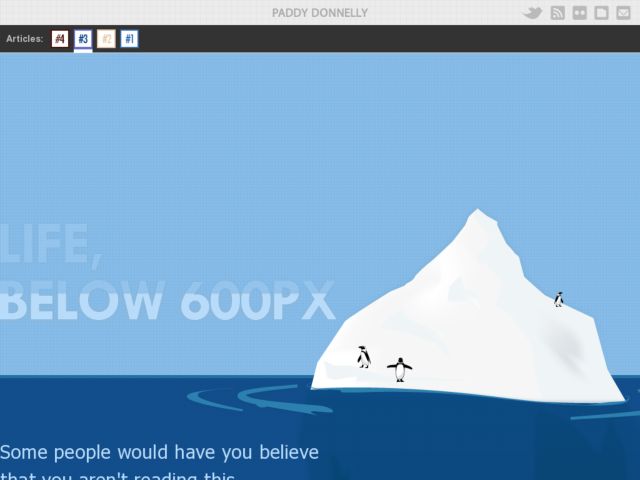
Paddy Donnelly flips the bird at the fold.
What I'm proposing is for you to think twice about these ‘rules’ which are preached so often around the web and aim to create something original. Don't live in the old world of pushing all your quality content on the visitor at once because they've only got 4 seconds before their attention drops (or whatever other statistic is doing the rounds at present).Think about the ultimate journey you want them to take. Entice them in, make them actively want to scroll and read on, and on, and on. Guide them with your excellent content and let them explore your site. Tell a story with your content. Space it out a little and you will have some happy visitors who actually want to be there!
A very fitting word to describe the state of web design at present would be
‘Samey’
So many sites have the same, big header, big fat call to action buttons, a sidebar, a big fat footer and the letterpress effect scattered about. Finding a bit of originality in the sea of sameyness is pretty difficult these days.