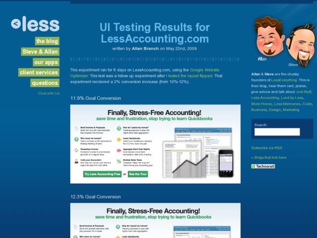
Less Everything did a couple of A-B tests on the call to action buttons on the home page of their Less Accounting product. Their first test modified the design of 2 buttons (see tour, try), using 1 button instead for the "Try Less Accounting" link and a text link for "See Tour". They noticed a small increase in conversion when they went to the single button, and then did a second test, reversing the position of the button and link.
Minor tweaks like these create small increases in coversions, but if the number of users is large, this could mean a significant difference in revenue. It's cool that they're so transparent about the design tweaks they're experimenting with.
http://b.lesseverything.com/2009/5/22/ui-testing-results-for-lessaccounting-com