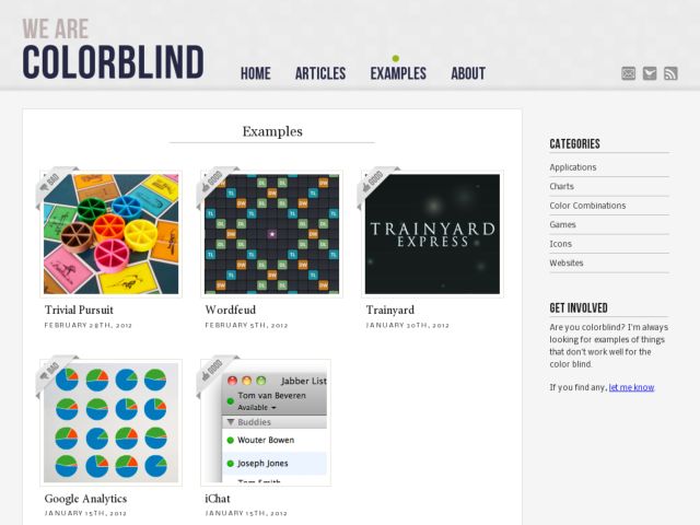
Tom van Beveren re-launches We are Colorblind. The site is restarting from scratch with new articles and examples of good and bad uses of color in terms of how those design decisions affect people with colorblindness. When you mouse over the examples, the screenshots allow you to compare the example with normal vison and simulated colorblindness. He also presents excellent examples for how these interfaces can be improved to become more accessible.