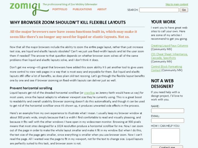
Zoe Mickley Gillenwater posted an interesting article which makes the argument that browser zoom doesn't obviate the utility of flexible (liquid and elastic) layouts. The argument is apparently being made that because of browser zoom, flexible layouts aren't necessary. But in fact, web designers that have fixed layouts know that the default zoom behavior on fixed layouts causes horizontal scrollbars. The fix is to use "Zoom text only" options, e.g. in Firefox and Safari 4.
Gillenwater makes the argument that in either use of browser zoom—normal zoom or text only zoom—flexible layouts not only give users control, but they also tend not to break and show horiztonal scrollbars. I move between both worlds. On this site, I use fixed widths with flexible em-based type that works well with Zoom Text Only. It's a decision I make knowing that it affects the smaller population that want to use a narrow viewport. But on the enterprise web software I've done front end development on, I use flexible layouts because of the audience and use. In those cases, designing for smaller laptop and netbooks, as well as mobile devices is a necessity.
It's an interesting discussion, and brings up issues to be aware of. In many scenarios, I imagine a large majority of users won't use browser zoom, and those that do will be the most likely to be aware of the difference of zooming the entire page versus zooming only text. Knowing your audience and choosing a strategy that's appropriate is the expected advice, but also knowing how to make the most of the capabilities of zoom while attempting to prevent breakage is what this is about to me. I don't intend to make this incarnation of Konigi, for instance, liquid or elastic, but I try to make type work when zoom is modified. Whereas other scenarios I could imagine for this site, e.g. a web app perhaps, might demand flexible layouts.
http://zomigi.com/blog/why-browser-zoom-shouldnt-kill-flexible-layouts/
