


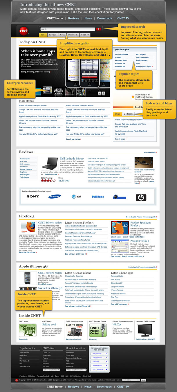


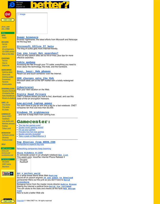
CNET redesigns its identity and with it, all of its sites now sport a cleaner, more modern aesthetic. Some claim that the original c|Net, with the block of yellow navigation on the left hand side was responsible for the proliferation of that layout type in the 90's. Today there is only a hint of yellow, and that left sidebar that held most of the site navigation is now relegated to a simpler, singular category or local navigation purpose within a section. A big improvement. The global navigation at the top serves to keep the user situated in the larger scheme of things.
CNET is a huge site, and because of that, it is probably difficult to keep the home page simple, while addressing the needs of their divisions. They've been evolving their design over the years (as you can see from the last 3 screenshots) and the current and past designs have moved towards a cleaner look, and simplified navigation. If you compare this home page with the prior design, they appear to have made stronger, more selective decision for keeping the home page less cluttered and easier to skim.