
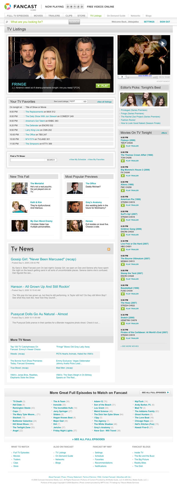
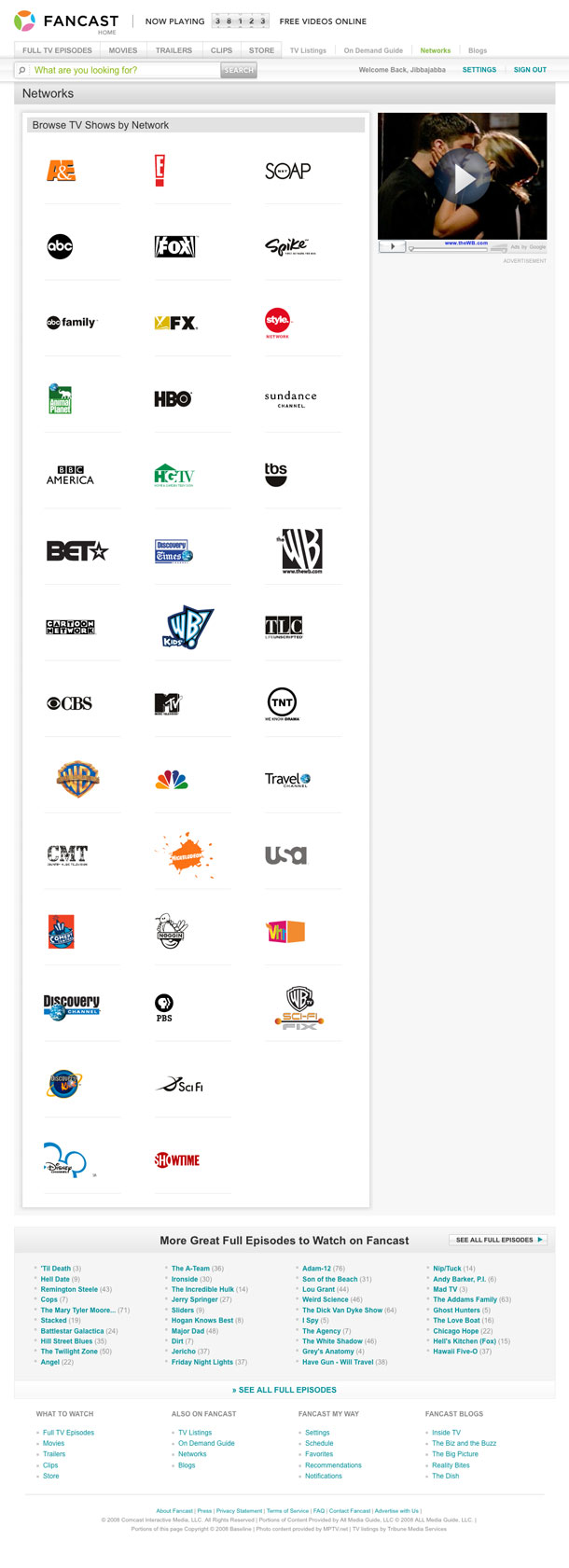
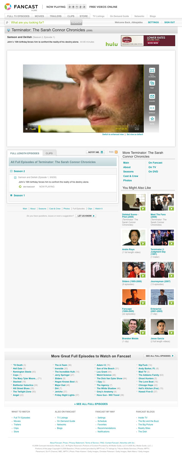
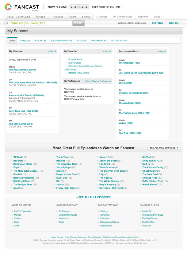
The slight redesign of the surface on Fancast is a lovely updating that comes along with the site's latest release and new inventory of video content. The presentation layer is sporting the clean and glossy look of white boxes with pale drop shadows that I'm fond of, as well as using soft white bevels with enough restraint to look good without going over the top. The overall look is softer, and might slightly reference the minimalist Hulu, but clearly outsexes that site.