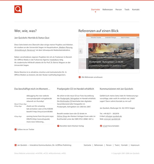
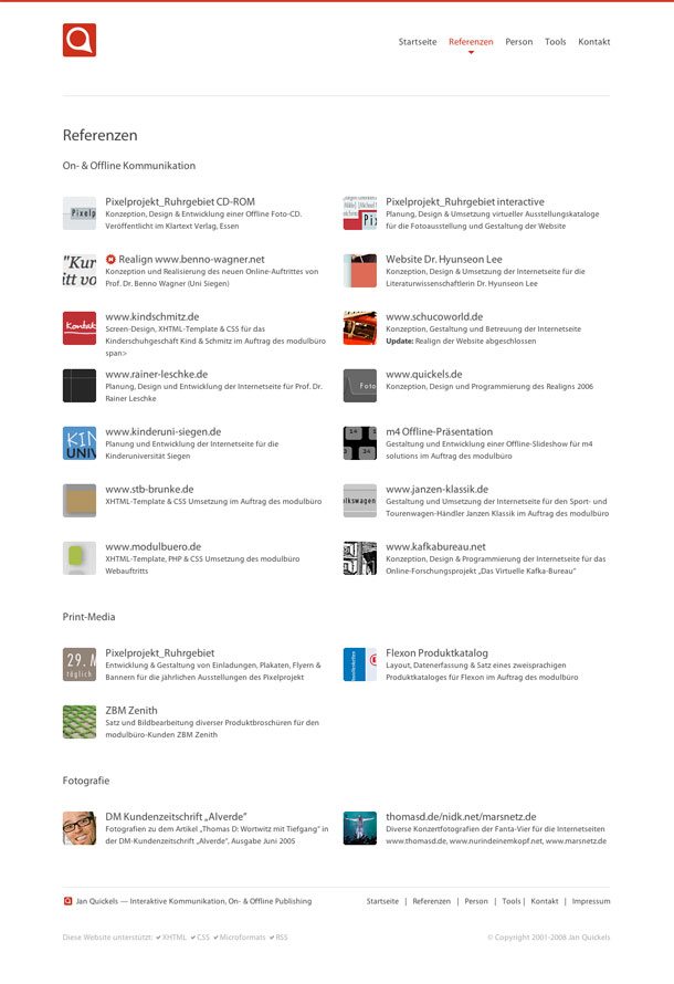
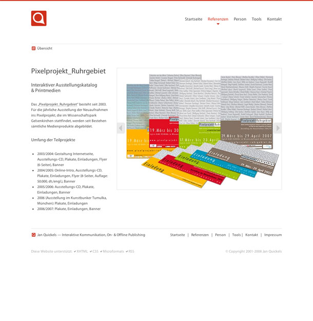
This is a clean, minimalist portfolio. I like the grid of projects in the portfolio and the simple project pages and slideshows. The feeling is very clean and easy to read, even with medium contrast gray text. The brown/orange accent color works very well on buttons and highlighted text.
The only thing I thought odd was that the site name didn't accompany the logo in the upper left. I realize the name is visible title bar and footer, but it might be useful to see near the logo if you arrived from an inner page.