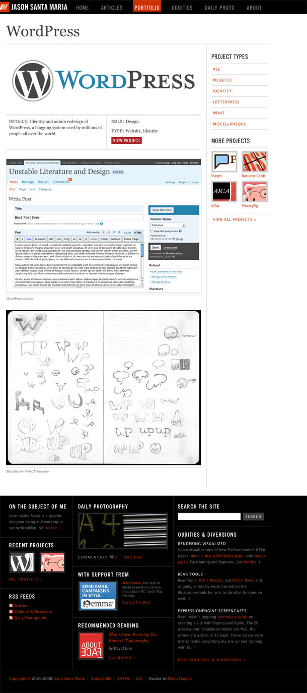
Brooklyn visual designer Jason Santa Maria redesigns his site with a more flexible system that will allow him to adapt the design of each entry to suit the content. He notes that this is a redefined focus on art direction, and a magazine approach to content publishing outside of the typical confines of a CMS templating system.
I liked previous site design, and its reference to physical print. But I find that while the new visual style might refer back to the feeling of print, this visual style is more appealing to me as a someone who tends to be drawn to modern design. The larger font sizes and greater contrast between header/footer elements and content gives it a more forward-looking feel to me than the warm colors in v2. Love it.