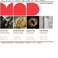
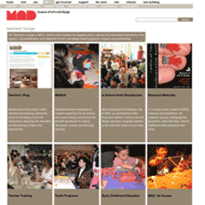
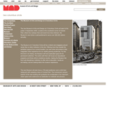
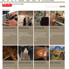
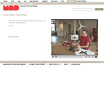
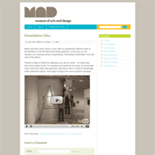
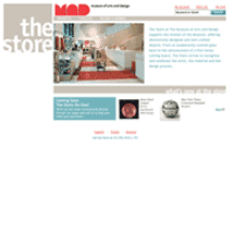
My first impression when landing on the MAD Museum site is that there is a sense dynamic tension between the huge decorative shapes that make up the bold MAD logo and the clean layout, whose grid and the solid blocks of type and photos feel very modern. There is an appropriate feeling in that tension that works well to characterize a museum like this, that houses objects of such a wide range of styles and periods.
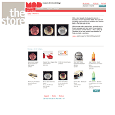
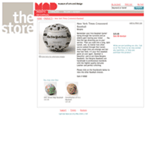
I like how the MAD style and color scheme carries over, more or less, from section to section. When leaving the site proper to the blog and store, for instance, the visual signature of the logo keeps you connected to the MAD Museum family, as do the subtle variations of the color scheme which still reflect back on the muted tones of the main site.
What I don't like are maybe minor details, but local navigation links on the main site occasionally jump the user out of the section they're browsing. The task-based navigation labels are nice though: visit, see, do, get involved, etc. I also dislike the shift from fixed left position to centered position when you go from main site or store to the blog. It would be nice to have a bit more consistency in the grid and layout between these sections.
