MetaLab

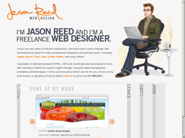
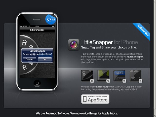
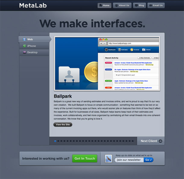
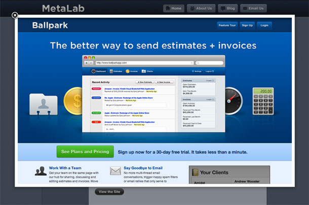
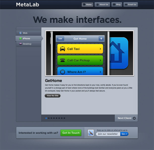
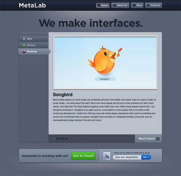
Metalab's aesthetic evokes the crisp, metalic edges and rounded stylistic elements that I've come to associate with Apple. You can see it in the details of their gradients, shadows and lighting effects. The visual style is clean, but what I found most enjoyable was the combined use of vertical tabs and carousels on the home page—essentially their portfolio. The message is really simple and bold too. "We make interfaces, we strive for pixel perfection."

http://www.metalabdesign.com/

Erath Winery

From out of Oregon's Dundee Hills rolls a new web presence for its founding winery, those consummate Pinot masters who combine the "Art of Pinot" with the winemaker's pharmacological science to trample out the vintage where The Grapes Of Erath are stored at http://www.erath.com.

Visualize a glass of Fuqua or Niederberger's best, or, if you're feeling prime time, maybe a glass of pink from their Melrose vineyard, and enjoy their new website :).

http://www.erath.com/

Fever

Fever is a feed reading server product. The product site features a single-page design, with well-organized and clear product information at the top, and navigation anchors that scroll the page down. All of the features you need from the service—purchasing info, account info, customer support—are included dynamically in the single page, so once you've purchased the product, for instance, your customer info is populated into the account area. Support forms are also in-page. Simple and clever.

http://feedafever.com

Palm Pre

Palm's Pre product page has a serious, polished look that I assume is targeted at a "grown up," no-nonsense audience, judging by the business user scenarios in the video and the big kitchen counter backdrop. The smooth, rounded corners of the page's UI elements echo the pebble shape of the phone and the circular shapes of the Pre OS. I like the use of depth of field with the full bleed photo, the hover of the boxes on the right, the change in state when clicking the site search box, and the categorized features at the bottom.

http://www.palm.com/us/products/phones/pre/index.html

Bad Ass Ideas

Samantha Warren's blog and portfolio is features some great layered graphics in the trompe l'oeil header and footer and some lovely type. I like the paper textures, the subtle shadows and little 3D effects, the nice treatment of the search box, and the general feeling of dynamism created by the asymmetry of the header/footer and layering, balanced by the strong alignment in the body. Nice stuff.

http://badassideas.com/

Park Avenue Armory

The site for the Park Ave Armory, a non-profit venue for the arts in New York City is a clean, modern looking site with a simple 2-3 column grid that makes minimal use of graphics and presents information simply. There's small change in the logo and heading colors to add some variety and the navigation is clear.

http://www.armoryonpark.org/

BooneOakley

Ad agencies are outdoing each other in terms of clever uses of social media. BooneOakley's new web site is actually a series of YouTube videos with links placed via annotations into the videos to connect all of what we might traditionally think of as sections. What they create is something like a network of hypertext connections to hold together a concept of site—hacked together boundaries that create space within another larger space. Using annotations to do that is pretty clever.

Some pretty harsh digs on large agencies, and a really funny jokes in there. Appropriate to the kind of witty work they do. I also like their use illustrations over the timeline to create another sense of navigation. The video production in their client reels are really enjoyable as well.

https://www.youtube.com/watch?v=Elo7WeIydh8&annotation_id=annotation_332152&feature=iv

Chateau Ste. Michelle

The online brand re-invention of highly regarded Ste Michelle Wine Estates hits full stride with FINE Design Group's launch of the Chateau Ste Michelle site at http://www.ste-michelle.com/. Dramatic images of the Pacific Northwest's most renowned wineries combines with functionality like events calendars, retailer locators, reviews search, interactive maps, wine browsing, to bring the Chateau Ste Michelle family of brands to life.

http://www.ste-michelle.com/

WhiteHouse 2.0

This selection of screens showcases the different social networking and video sites that the Whitehouse has set up. It's interesting to see how much continuity and consistency they're able to achieve given the design constraints imposed by the sites. Perhaps they're given the unique layout options Networks get on YouTube channels. But they couldn't do much with the Facebook page. The MySpace implementation is particularly impressive as an example of site skinning. More info about these sites can be found in the White House 2.0 article.

http://www.whitehouse.gov/blog/09/05/01/WhiteHouse/

Pixmac - royalty-free pictures & illustrations, photos & stock images

Over 3 millions of professional royalty-free photos of about anything are available online through the PIXMAC microstock photobank (www.pixmac.com). Press, graphic designers or bloggers can order photographs they need.

The customers can browse the photos by keywords, or they can use the unique database of fresh, daily updated royalty-free celebrity photos.

Although Pixmac sell the photos cheaply, it pays the authors well thanks to the size of the global Internet market.

Pixmac offers a free professional keywording (choosing the keywords to describe the photo). So the photos are not hidden in the database.

Pixmac customers can buy particular photos on demand or they can buy a subscription a monthly, quarterly or a yearly subscription. The prices start at 6 cents per photo.

http://www.pixmac.com