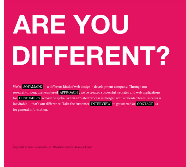
SOFAMADE are a design and development shop in Arlington, Texas.
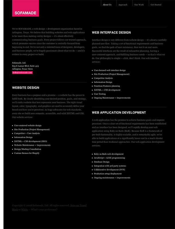
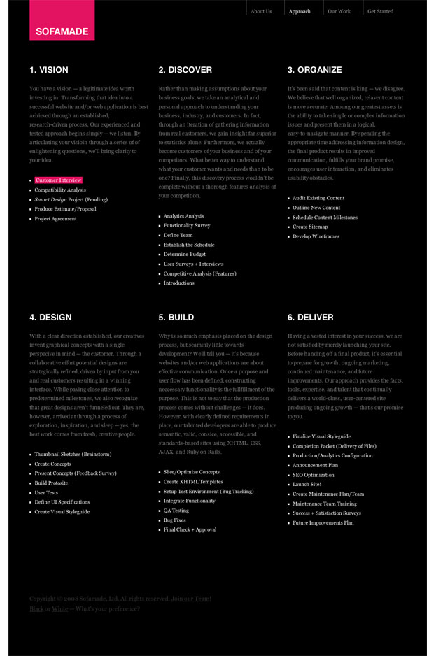
What I liked about their site most was the bold front page colors and intro paragraph with inline links and the wide 2 and 3 column grids that varied from page to page. The layout of the text-heavy Approach page and the Portfolio pages is clean and easy to read, although I thought the Approach pages did a better job at indicating the hierarchy of page elements. The black/white style switcher is also a welcome setting for people who dislike reversed white/gray on black.
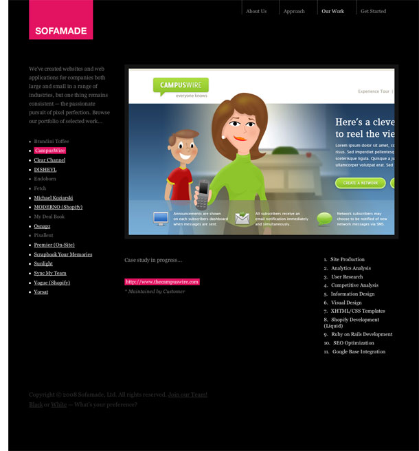
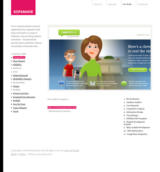
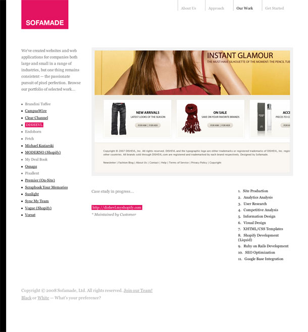
What I wasn't crazy about was the handling of link colors in the portfolio section, where they break the convention of using pink background colors, and only use pink to highlight the current project. It took me a second to see that out. In other areas, pink text is used to accent copy. I also dislike lightbox effects that require scrolling the page for long images in order to keep the correct width.