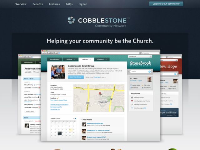
Excellent use of subtle shadows and gradients in the header navigation. The faint radial gradient for the lighting effect on the centered logo is perfect, perhaps making reference to the light from a church apse shining down on an alter, which of course has symbolic meaning. It's a very subtle thing, and I'm not sure it's intended, but it has a powerful effect and adds a subtext to the design.