I'm a fan of the drop down menus that span a wide area, e.g. the main body or full page, in order to show a wider range of options rather showing fewer in a vertical drop down and forcing navigation through a fly-out tree. This convention is showing up mostly in global navigation, and with the introduction of Microsoft's Ribbon, we can expect to see more of it.
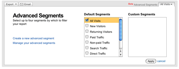
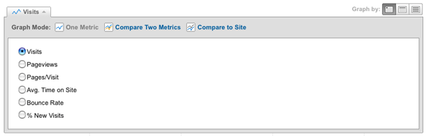
Google shows buttons with down arrows to indicate that clicking one of those controls will show expanded options in-screen, a la the drop down menu. However, rather than floating a div above the flow of the page, their control expands a div in place below the button, and the expanded div is attached to the button which now looks like a tab. The page flow is respected and content is pushed down, and as each control is opened, any expanded controls are collapsed.