User Interface Design Gallery

A gallery of user interfaces that I've collected over the years.

Facebook Form Auto-completion

Facebook's address auto-completion in the compose message form is one of the best examples of auto-completion behavior in a form. The interaction very closely mimics what you would expect to happen in the To field of email applications like Apple Mail and Outlook.

1. Cursor is in the To: field. Contextual help displayed below input.
2. Typing characters in the input invokes person/recipient auto-completion suggestions.
3. Selecting a person from auto-completion suggestions, entering a comma, or clicking enter displays the selected recipient in a block. The recipient's name cannot be edited, but it may be removed by using the backspace key or clicking the "x" next to the name.

http://www.facebook.com/inbox/?compose

Last.fm Tagging

Last.fm provides a simple interface for tagging artists or tracks that mimics the email address entry design pattern provided in applications like Apple Mail and Facebook Messaging. Their redesign (beta site accessed May 2008) cleans up their tagging interface by providing auto-completion, and the ability delete tags by clicking the item in the input.

1. Clicking the More menu displays the Add Tags link. Presumably, there will be more than just an add tags item in the future, otherwise Add Tags should simple be visible without this extra link.
2. The Add Tags dialog displays as an overlay. Typing in the input provides auto-completion from the user's previously used tags and other tags available to the user.
3. Selecting a tag from auto-completion options, entering a comma, or clicking enter displays the tag words in a tag block. The tag text cannot be edited, but it may be removed by using the backspace key or clicking the "x" next to the tag.
4. Confirmation after clicking Save.

http://beta.last.fm/home

Apture Text Editing

The Apture service allows web site publishers to easily find and incorporate multimedia content from the web into their site. Apture requires one line of javascript code to work. The service embeds dynamic links in the page that allow users to preview content from the outside sites in AJAX layers over the page content. Publishers can choose to automatically generate links from certain sites, e.g. YouTube and Wikipedia. They can also create links by selecting text on the page and finding the content they want to embed.

In the example at left, I show the simplest use case, where you want to link a term to its entry in Wikipedia. What I like most about this is how easy it is to add more information to your pages without having to do editing of the original content. I could see this kind of functionality being very useful for altering original content if these kinds of widgets were available within the rich text editors themselves. It's very nicely implemented, and if set to only fire on click (rather than on hover), this is nowhere near as intrusive to me as ad-supported services like Snap.

Content editors who don't want to know anything about HTML need simple interactions like this to make their work quicker and easier. I imagine that this kind of interaction could be scoped within a specific body of content as well, e.g. to easily create links within a wiki. CMS vendors take notice.

1. Invoke the Apture editor by pressing a keyboard shortcut or bookmarklet.
2. Select the text you would like to link and find the media you want to link to.
3. Preview the media, in this case a Wikipedia entry. Then click "Link this item" button.
4. Now when users click the link in your page, they will get an AJAX layer with the entry content.

http://www.apture.com/

Inquisitor Search

Inquisitor calls itself Spotlight for the web. The free search plugin is installed in Safari and provides better search results using Safari's built in search box. When a user enters text into the input, Inquisitor displays a drop down menu with results suggestions and search term auto-completion. The first section of the drop down shows matching results pages in Google, and in the second section shows auto-completion suggestions for other terms that match the entered text. If you edit the search preferences, you may also see links to narrow your search to a particular search engine, e.g. IMDB, Flickr, Google Blogs, etc. You may also set keyboard shortcuts to quickly trigger results from one of the search engines you've added.

http://www.inquisitorx.com/safari/

When is Good

When Is Good is a tool that does one thing—helps a group of people choose the time for their next meeting or event. One person starts by clicking (or clicking and dragging down) all the times that they are available on a calendar grid that shows 2 1/2 weeks of time slots. When Is Good then provides a link to circulate to participants, who see the proposed times and click on when they are free. Whoever started the calendar gets to see the combined results.

http://whenisgood.net/

Brooklyn Museum Click! Rating

The Brooklyn Museum's Click! show is a crowd-curated exhibition that accepted user submissions for photographs that reflect the theme, "The changing face of Brooklyn." Following the submission period, visitors are asked to help curate the photography show by evaluation submissions on their effectiveness at demonstrating the theme. The interface for evaluating photos steps the user through each entry and provides a slider control to rate the photo on a scle from most effective to least effective.

1. Introduction to show and guidelines for evaluation photos.
2. Example photo with evaulation slider and user statistics on right.
3. Photos include artist's title and description.

http://www.brooklynmuseum.org/exhibitions/click/

QUEEKY Ratings

QUEEKY is a drawing community that allows users to draw pictures in their browsers using the site's flash application. Users can rate the drawings using a rating scale ranging from 1 (Hmmm) to 10 (A masterpiece!). Scores on the low side are color coded to a cool violet color and on the high side towards a hotter pink/fuschia.

1. Low rating
2. High rating
3. Full page

http://www.queeky.com/

Google Sites Rich Text Editor

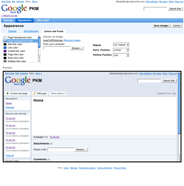
Google Sites, the new wiki application that is now part of Google Apps is a content management tool based on the JotSpot service acquired by Google. Sites retains the excellent rich text editor tools that JotSpot had.

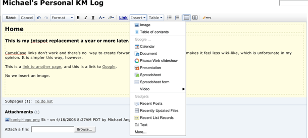
The formatting bar allows users to do the simple things you would expect from a word processor, such as making font changes and adding styles such as headings to text, insert lists, links, images, and table of contents. There are very well executed tools for laying out the page in 2 columns and inserting tables. It also allows you to do more sophisticated things you can't do with a word processor, including inserting Google Docs Documents and Spreadsheets, Presentations, Picasa Slideshows, YouTube video, and Gadgets which execute bits of code to do things like insert lists of content from your wiki into the page. Advanced insert tools like this have been commonly offered in more sophisticated CMS, blog, and wiki software that are largely used in the enterprise CMS space.

The Sites rich text editor feels like a very clean, and fast alternative to some of the more bloated WYSIWYG tools offered as plug ins for CMS. Many of the formatting tools I've encountered go the simplest route of using markup shortcuts and special syntax, which works well but requires a learning curve. Or they go the other route, which is to mimic Microsoft Word and include everything you might possibly want to use, and sometimes also give you the messy HTML to boot. This editor feels like it's somewhere in between, in that sweet spot where users are given just enough to get the job done, and even more under the hood when they need the power tools. It's fast, efficient, and intuitive.

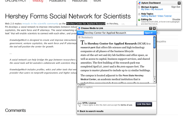
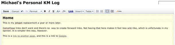
1. The text formatting toolbar.
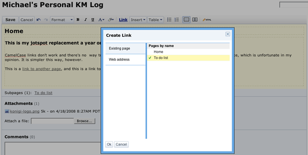
2. Creating a link to a named page on the wiki.
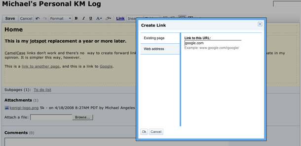
3. Creating a link to an external URL
4. The insert menu.
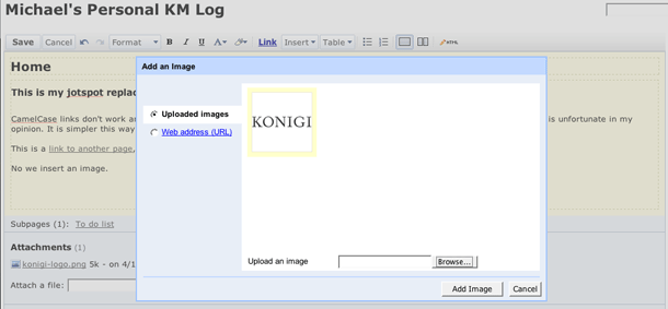
5. Inserting an image by uploading a file or referencing an external URL.
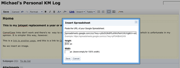
6. Inserting a Google Docs Spreadsheet by pasting public URL.
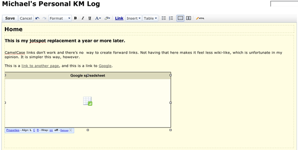
7. The inserted spreadsheet selected in the editor with links to bring back property inspector and handles to resize.
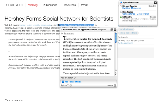
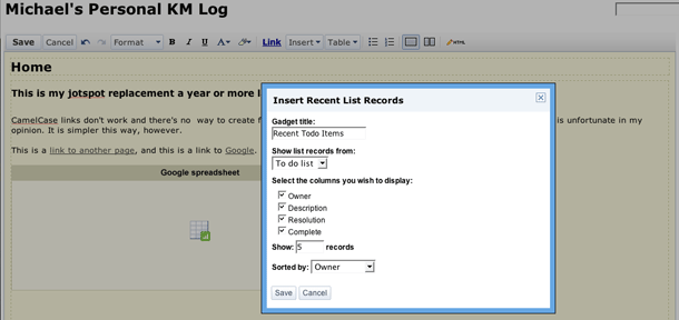
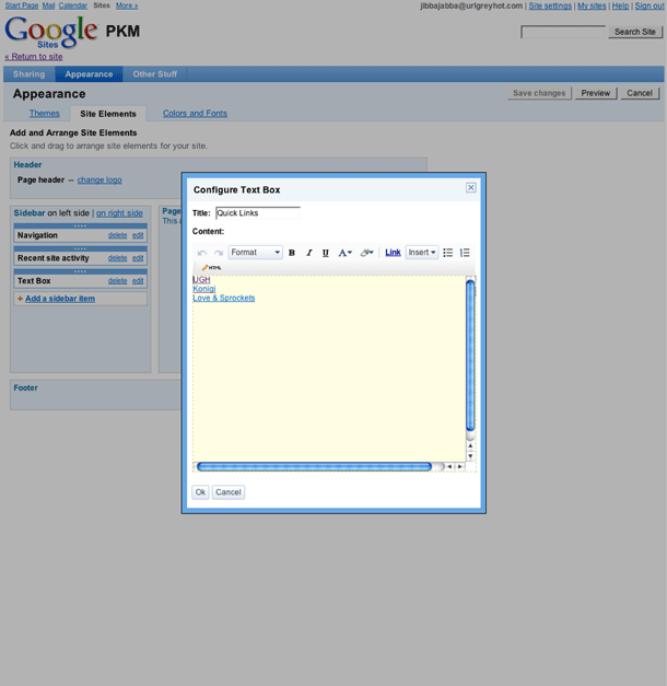
8. Inserting a "Gadget" to display a block recent todos created on this wiki.
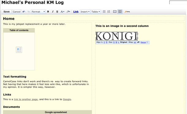
9. Editor showing 2 column layout and styles applied to text. Inserted image selected.
10. Insert table menu.
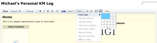
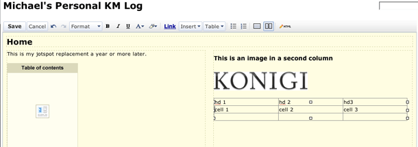
11. Editor showing inserted table. Table is selected and shows resize handles.
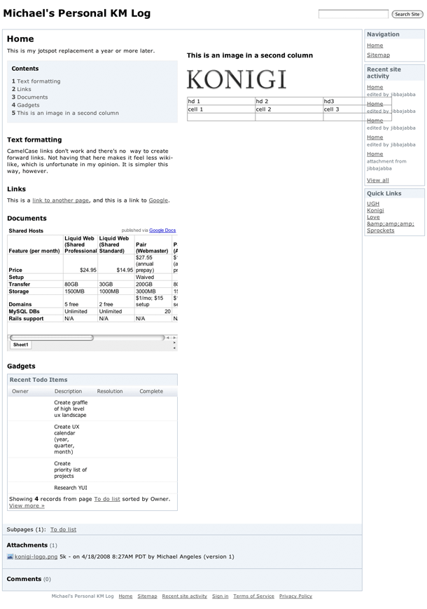
12. Published page with all edits applied.

http://sites.google.com/

Google Sites Theme Editor

Google released the technology acquired by JotSpot as the new Sites tool in the Google Apps suite. The Sites tools provides the interface you see here for modifying the appearance of your site, using pre-defined themes as a starting place, allowing you to modify the layout of content modules in the left column, and the colors used in the layout.

1. Selecting a theme.
2. Modifying page elements.
3. Configuring a module.
4. Setting colors.
5. Setting background images.
6. The modified site appearance.

http://sites.google.com/

Pattern Tap Tag Filtering

Pattern Tap, an interface and visual design gallery, provides a UI for filtering using tags. Best case scenario would get rid of the filter button and also updates the set of available tags to indicate those that can be combined with the current selection (e.g. dim or hide tags that can't be combined with my selection "black AND white" AND simiple." Often times in interfaces that provide filtering based on all available tags or index terms, if the filtering UI doesn't update to reflect those terms that may successfully combined, the user is led down a path to an empty set. del.icio.us is one example I can point to that prevents this error. I really like the execution of this interface on Pattern Tap, but would love it if that added logic were there.

1. The tag filtering interface with no selections.
2. Clicking + icon adds the tag.
3. Several more tags added. Clicking a selected tag removes it. A filter button submits the selections.

http://patterntap.com/

Indeed Faceted Navigation

Job search engine Indeed offers faceted search filtering in their results. Facets include useful filtering criteria such as job title, salary range estimate, company, location, and job type. Filters beneath any facet may be selected at any point while viewing the results, and removed in an ad-hoc manner regardless of the order selected. Users may also remove all filtering to return to original results.

1. Search interface.
2. Search results with filters on left column which can be hidden/collapsed.
3. After selecting a filter under salary. Filter may be removed by clicking "undo" next to term.
4. After adding filters from Employer/Recruiter and Job Type facets. Multiple filters may be removed by selecting "undo all."
5. After adding location.

http://www.indeed.com/

Apple Site Search

Apple provides an excellent site search design, which includes an AJAX auto-completion drop down menu showing categorized matches against your query, and thumbnail images of matching items. The categories carry over in the search results page, which displays your results in collapsible sets, much as you would see with the Mac OS Spotlight search. Some result sets are even rendered as a carousel (look at iTunes results).

1. Auto-completion drop down shown for query on "iph."
2. Search shown in page context.
3. Search results sets.
4. Doing a search for "virus" displays a nice little easter egg. (Thanks, Mark, for the tip)

http://www.apple.com/search/?q=iphone

Capzles Captcha

Capzles, a photo management and sharing services uses animated text in a Flash captcha to trick the robots. This is the most sophisticated attempt I've seen to make captchas unreadable. It still can't beat the spam sweatshops, but it seems to me like a very good option for defeating OCR.

http://capzles.com

ibeatyou rating

ibeatyou is a video portal that allows people to create challenges to compete on anything. Users either upload a video, record from webcam, or import from YouTube.

The rating system is a whimsical little widget for allowing a score from 1 to 5. The vote is indicated by a little blue man holding up a scrore card. They also provide a qualitative award, allowing users to give an award to the entry and name it anything they like.

1. Video page with player on left, and other challenges to the right of player (typical playlist format).
2. Entry info. Rating is indicated on hover as person icon with score card held over head. After rating is applied, user's score in the user point system is indicated.
3. Clicking the "award it" button allows users type an award name.
4. Award saved to right sidebar adjacent to comments.

http://www.ibeatyou.com/

Publicis & Hal Riney Webcam Gesture Navigation

The Publicis and Hal Riney site attempts to innovate navigation by replacing mouse input by detecting gestures the user makes against their webcam. Once the Flash file embeds your webcam video into the lower right corner of the page, a body outline is superimposed, and hot spots in the North-South-East-West quandrants are ghosted on the screen to show where you should hold or swipe your hand to navigate. Unfortunately the video ended up eating up resources on my machine to the point that the load times were painfully slow.

This site reminds me, in a way, of the Don't Click It site, which was a proof of concept for using mouse gestures rather than requiring the user click on links. It also reminds me of the Eye Toy game for the PS2, and the ToySight game for the Mac. There are several of these camera-based TV games available.

From personal experience, I can say that I found the EyeToy game interaction fun for several minutes while passing through a game store, but the experience with the ToySight game on the Mac is absolutely frustrating and pointless. This is the same feeling I get after playing with the Publicis and Hal Riney site. Using webcam gestures for the purpose of playing a game is quite different from swiping your arm around in order to navigate an information space. Additionally, besides the 4 directions provided for navigation, there is only one gesture used to select/click content on the page--the space bar. Don't Click It succeeds, at least, in that the gestures of a mouse are small. Having to pick up my arm to simply paginate seems a bit much.

Using the webcam gestures for interaction on their web site seems very misplaced. If the purpose is to demonstrate the idea, I'd think a separate demo for that specific purpose might be great. The visual design, on the other hand, is beautiful.

1. Splash screen asks user to select mouse or webcam for user input.
2. Webcam input shows your body placed in center with N-S-E-W hot spots for navigation. Space bar is used to provide click input.
3. Hot spots used for pagination (prev-next).

http://www.hrp.com/

Searchme Visual Search

Searchme provides a search interface that provides screenshots of search results. The user interface is a flash application that mimics Apple's new coverflow display in the Leopard finder. The search options provide category filters, and relevant categories are displayed once you've typed search terms that match a category. The example here shows categories that are relevant to the search for "new york city."

Search results provide more information about the site when the user hovers over the screenshot. Optionally you may click the control below the screenshot stage to pull up text results. You may scroll the screenshots to the right to view more, and after a full right scroll, more results are added to the window, although sadly, the scroll length is not visually represented in the scrollbar.

The service is presently in beta, so the quality of results may not be up to par with search engines you're accustomed to using. It's a glossy for search. I think it would be nice to see if they could do a version of this using only JavaScript and AJAX as well. Performance is really quite good so far.

1. Default search form.
2. After typing search terms, matching categories appear.
3. Default results screen, showing "Search All" results.
4. Filtered results after selecting one category, "Restaurants."
5. Displaying the text search results panel.
6. Scrolling through to view results.
7. Changing settings to use "daytime" theme.

http://searchme.com/

hulu Carousel

Hulu provides an interesting carousel for the promotion of content on their home page. They use a large stage that spans the entire width of the browser window and shows one promoted piece of content at a time. Left/Right arrows allow the user to page through the promos, and a representation of the promos as mini-screens (small multiples) at the bottom of the stage allows the user to see what number they're looking at, among the total promos. Clicking one of the small rectangles allows the user to jump to that promo. If the user doesn't click on the stage after they arrive to the home page, the carousel automatically scrolls through to the following promos, one at a time, slideshow style.

1. Home page with carousel.
2. Selecting next promo.
3. Clicking icons to jump to promo.

http://www.hulu.com/

IHT Top Stories Module

The International Herald Tribune site has, in my opinion, been the site that set the bar for clean, minimalist newspaper web sites since John Weir worked on the design circa 2000/2001. The evolution of the site has continued to stick to Weir's minimalist visual style, although his innovative DHTML column and clipping behaviors are gone.

The top stories content module is an interface element that is a common feature in news sites. IHT implemented their module in as minimally as possible, providing 3 time slices beneath the header and a link to the RSS feed. Contrast this with the top stories module provided by Newsweek. I'm including this in the gallery because I think it demonstrates the type of simple presentation where the interface chrome gets out of the way so that users can get to what they need with no fuss.

1. Most emailed articles module. Tabs as inline links to select time slice.
2. Module seen in right sidebar of an article page.

http://www.iht.com/

Songza Radial Menus

You rarely see radial menus implemented on the web. Radial menus provide a branching interface from a single starting point. Songza uses this interface convention to provide a very interesting way of selecting from 4 categories of actions that can be performed on a single song: play, share, rate, playlist. These are categories of actions you typically get with audio and video media on web sites. The radial menu allows the designer to keep the display simple, so the user can focus on the lists of titles. What might be an interesting additional thing to do here is provide a double-click event that could trigger play rather than having to view the menu. This is a very simple and elegant implementation, and among the first and best applications of radial menus I've seen on the web.

1. Default page view
2. Click a song link and a radial menu is displayed.
3. Hovering over left side displays "Share" submenu.
4. Hovering over right displays "Rate" submenu.

http://www.songza.com/

Digg Contact

This is perhaps more about information architecture than interface or interaction design. One thing I like about Digg's About section is the transparency of the company that's suggested here. They only provide email addresses for contacting the company, rather than providing a form. They provide 4 types of contact: feedback, abuse, press, and partners, each type of gets sent to an email address. This exposes you, the sender, as it doesn't allow the sending of anonymous email, and gives them a way to respond to you. It also gives a sense that someone will respond, which is not the perception I have when I fill out a form and get an autoresponder. That may provide a false sense of openness, however. With the volume of traffic Digg gets, I wonder if they are able to respond to each piece of communication they receive in a timely fashion. To further emphasize this transparency, Digg exposes who the staff are by providing a list of avatars linking to each person's Digg profile.

Digg provides a form for contacting them regarding bugs, which makes sense because in this case they want more information about the page you're looking at, the browser/OS you're using, etc. That doesn't appear to be done very well, however. Clicking the Report Bug link from the footer could auto-fill the referring URL, and grab the Browser and OS using environmental variables.

1. Main "About" page.
2. Mailto links for contact info and report a bug links in right sidebar.
3. Digg staff.
4. Bug Report form.

http://digg.com/about

Daylife Favoriting

Daylife provides an excellent mechanism for favoriting. The news portal, which is published to demonstrate the company's news delivery product, provides a simple method for saving favorites that uses a star icon. The site classifies articles into topics which are simply terms describing a subject matter, person, or company/organization. Users see star icons when they hover over a link to a topic or a story. Starring the link adds the topic or story to their "starred items" list in their account. The list of starred items is filterable by type, e.g. topics, stories, searches, quotes.

1. News page for "Steve Jobs."
2. Starring topic "Steve Jobs" and adding a note.
3. Starring a story.
4. Starring a search.
5. Viewing all my starred items.
6. Filtering my starred items to Topics only. Other types that can be filtered include: stories, searches, sources, photos, and quotes.

http://www.daylife.com

Gawker Media Video Comments

Gawker Media's weblogs provide a simple method for including YouTube videos in comments. The example shown here is from the Consumerist blog. Users find a video in YouTube, copy and paste the permalink URL into their comment on the blog, and the video is embedded into their published comment. This method of transcluding content is popular in wikis, but the implementation usually involves using a special syntax. Gawker's method of using translating the permalink is dead simple.

1. Typing in to the comment form shows text in page above the form.
2. Pasting the YouTube permalink into the comment form. Video thumbnail appears immediately in page.
3. Clicking the "Watch video" link shows the embedded video player.

http://consumerist.com/356756/new-feature-embed-youtube-in-comments

i'minlikewithyou Comments

i'minlikewithyou's full Flash interface pushes the boundaries of what can be done with user interfaces in terms of social interaction. The comment feature on the site's news articles and videos allows users to place comments (including a drawing) over the media. In the case of video, the comments appear briefly on top of the video at the points where people have placed them.

Because of the volume of commenting on these videos, tons of comments will roll by in a frenzied flash, so it's hard to read them all. Slow motion would work well here, but you may pause or click a bubble to read it. Luckily you can also turn off comments by clicking the bubble icon in the control bar.

This is a novel UI for this kind of community, but might be very interesting in controlled environments, and even useful as is flickr's "Add Note" feature for photographs. iminlikewithyou makes small things like this fun.

1. Clicked the "Add comment" button below photo for a news article. Dragged marker to place comment over camera.
2. Attaching a drawing to a comment.
3. Posting comment.
4. Posted comment bubble shown over photo.
5. Clicked on top of video player to add a video comment.
6. Comment bubble appears in place over the video alongside other user comments.

http://iminlikewithyou.com/#/video/36

Newsweek Top 10 Module

Newsweek uses Clearspring's Flash widgets to display top read and emailed stories as a content delivery module in a sidebar. This module is like most top story modules provided on news sites, e.g. NY Times, but the interesting features are the ability to adjust the range of stories by time (notice the nice slider control) and to embed the module as a widget. While this module is implemented as Flash, there is no reason it can't be done as XHTML and Javascript.

1. Top 10 module showing "Most Viewed" and "Past 7 days" time slice selected. Can also view "Most emailed."
2. Time slice (slider control in lower right corner) adjusted to "Past 7 days."
3. Clicking the "Clip this" icon in the upper right displays the Clearspring widget controls to Email and Embed this module in an external site.
4. Clicking the "Preview" link for any story displays a summary of the story in a lightbox.

http://newsweek.com

Howcast Video Player

Howcast is a web video site founded by veterans of Google and YouTube, to "bring together the personality of user-generated content with the quality of a professional video studio." The videos produced by the site bring a higher standard of quality than Google and YouTube, and offer interesting features such as chapter markers and time-marked notes called "steps" in Howcast parlance. The content is targetted at information seekers of how to, tutorial, and DIY instructional video.

1. Video page (minus global and local navigation).
2. Video player.
3. Step marker in timeline and step tab below player.
4. Popup window that appears when "View All Steps" or "Print Steps is clicked.
5. Feedback form appears when "Post Feedback" button is clicked. Allows categorization of feedback by type.
6. Full screen video player. Steps, when displayed, are docked to the right.
7. About panel with author info, video metadata, voting, and sharing options. Link sharing panel appears by default.
8. Bookmark sharing panel.
9. Email sharing panel.

http://www.howcast.com/videos/1101-How-To-Pretend-Youre-a-Real-New-Yorker

Drupal Captcha

Drupal's captcha module offers some creative alternatives to the typical distorted text of image captchas. These are a few of the examples that are much more readable, and arguably less frustrating.

1. ASCII art captcha
2. Math captcha
3. Text captcha
4. Lost character captcha
5. Phrase captcha
6. Riddler captcha

http://drupal.org

MotionBox Video Player Clipping

Motionbox provides a nice interface for creating clips of videos they host. Along with Hulu, Motionbox is among the first to introduce the idea of clipping portions of web video. However, Motionbox outshines Hulu in terms of usability. Clipping is a simple operation that mimics the video selection paradigm users have become comfortable with on video editing software. And unlike Hulu, Motionbox provides instant feedback about where the start and end markers lie, by moving the video playhead with the position of the markers as you adjust the clip size. The filmstrip and the click and drag behavior for arbitrary clip selection also give the user the feedback and control that they're probably expecting for this type of feature.

1. Video player with filmstrip of thumbnails shown below playhead.
2. Clicking "Select Clip" drops clip markers to the left and right of the playhead position and displays emailing/linking/preview options. Playhead snaps to whatever marker is in focus when adjusting clip length. User may also click and drag arbitrarily to select a clip area.
3. Clicking the "Link to Clip" button copies a link to the video with start and end markers as part of the query string.
4. The permalink for the shared link to the clip loads the full video, but only plays the clip segment selected in the prior steps.

http://askeric.motionbox.com/2008/01/episode_10_top_5_uploading_tip.html