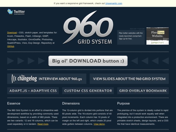
The 960 Grid System is a CSS Framework based on 960px width and can be used with 12 or 16 column grid. 12 column grid uses 60 px wide columns and 16 column grid is used with 40 px columns. Each has 10px gutters on either side or 20px combined between columns.
960 px was chosen as a base number because it is divisible by 2, 3, 4, 5, 6, 8, 10, 12, 15, 16, 20, 24, 30, 32, 40, 48, 60, 64, 80, 96, 120, 160, 192, 240, 320 and 480. Seems like fairly flexible system, although I find the classes in use on Blueprint, particularly when nesting, to be a little simpler.