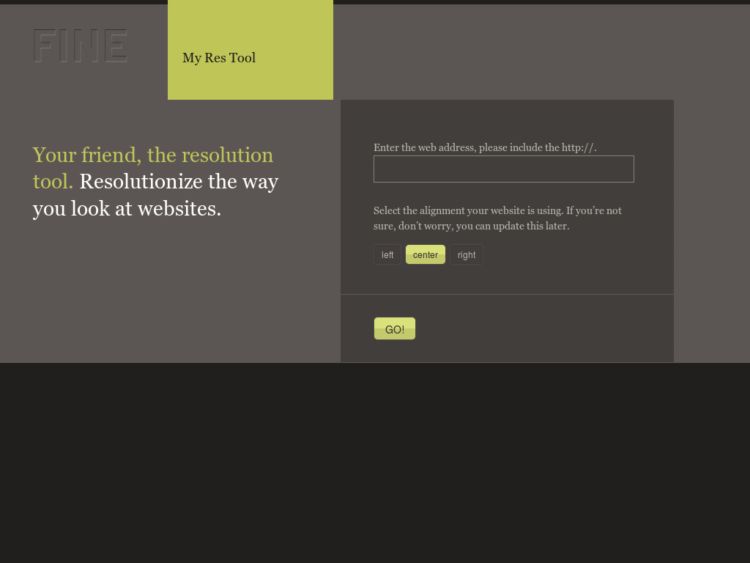
The folks at FINE Design created a browser-based tool for seeing how your web site measures up at different screen resolutions.
To use it, simply enter a full URL of your choosing. Up pops that location superimposed with a draggable set of rulers (x and y axis) configurable in center/left/and right alignment. These rulers allow you to view that site as it would be seen at different resolutions. So you can get a sense for what other eyeballs experience. A small dashboard at the bottom even gives you current stats on what resolutions most people use (hint: 1024 x 768).