How to research a company's UX in 30 minutes before your next interview
I got an interview for Staff Product Designer. I had a couple of days to prep, so I sat down to do what designers have always done before an interview. I dug into the product.
My first instinct was to build a tool to do the research because I’m a builder. The thought was this, “I can build a little app that pulls reviews from G2 and Capterra and the App Store, runs sentiment analysis, and shows me the points of pain and friction. It’d help with every future interview. Maybe it could be a side product.”
Thankfully I caught myself before heading to the terminal. I know how that story ends. I get sucked into scrapers and rate limits and anti-bot protection, and a few days later I’ve got a half-working tool and zero research done for the interview that’s actually happening. Pausing to think saved my bacon.
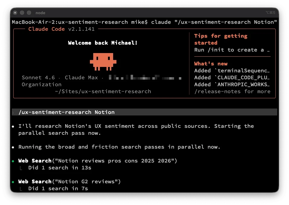
So I did the boring, correct thing instead. I just did the research in Claude by hand. It took 30 minutes. It produced better material than any tool I could have built. Then I turned the workflow into a Claude skill so I can do it again in 10 minutes next time. The downloadable skill is at the bottom of this post.
Why some candidates don’t do this
Walk into a design interview and ask “what are your biggest UX challenges?” and you’ve told the hiring manager three things:
- You didn’t use the product.
- You don’t have your own opinions yet.
- You expect them to do the work of framing the conversation.
We do it because real research used to take a full day. You had to find the reviews, read them, organize what you found, spot the patterns, then turn those into questions.
The economics are different now. With Claude running search and synthesis in parallel, you can do the whole pass in 30 minutes. So there’s no longer much of an excuse.
One caveat. What you get back is a summary of what’s been pulled from the sources the skill searches. It’s on you to read it critically and pressure-test what it raises.
The 30-minute workflow (as summarized by Claude)
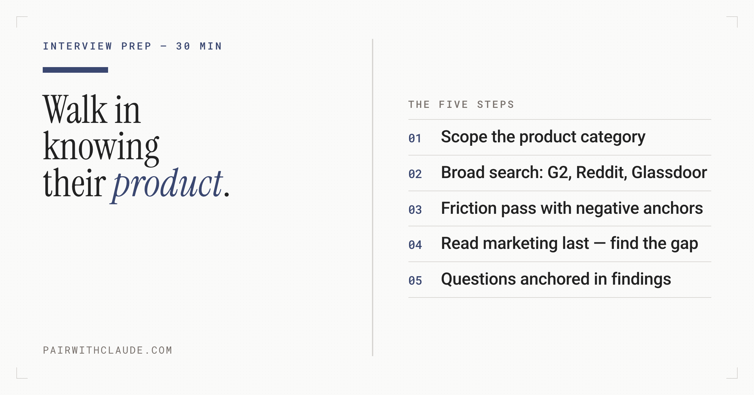
The skill goes through seven steps after you hand it the company name. Duration is a rough estimate.
Step 1: Scope (2 minutes). Name the product and note whether it’s B2B SaaS, consumer mobile, consumer web, developer tool, marketplace, or mission-driven tech. Different categories have signal in different places.
Step 2: Broad search pass (10 minutes). Do six or so parallel queries: G2 reviews, Capterra reviews, App Store reviews if mobile, Reddit, “alternatives to X” (reveals competitive friction), and Glassdoor (for internal product team complaints). Capture verbatim quotes with source names.
Step 3: Friction-targeted pass (5 minutes). Search with negative-sentiment anchors: [product] frustrating, [product] confusing, [product] missing feature, [product] doesn't work. Different sentiment words surface different shapes of complaint.
Step 4.1: Read the product’s marketing (5 minutes). Reading marketing first anchors you to the team’s framing. Read it last and the gap between promise and reality jumps out.
Step 4.2: Pattern-match (5 minutes). Group complaints into categories: wayfinding, error handling, onboarding, performance, feature gaps, integration friction, pricing clarity. If two or more independent reviewers mention the same thing, it’s a pattern. One-off complaints are noise.
Step 5: Generate improvements and questions (5 minutes). For the top two or three patterns, draft a concrete change and the framing for a question. Each question should reference a specific finding, not a generic platitude.
Final Step: Write up (5 minutes). Friction patterns with quotes. Two or three improvements. Three to five questions. Under 1,500 words.
That’s it. The whole thing is in a Claude skill I’m sharing below.
Review the output
I ran this on the company I was interviewing with. I can’t share that one, but here’s the same pass run on Notion so you can see the shape of the output.
Notion UX Sentiment Research
Sources scanned: G2 (10,149 verified reviews), Capterra (4.7/5 across 2,000+ reviews), Reddit (r/Notion), UX Planet, Medium, Hacker News, and targeted Google searches across alternatives discourse.
Time spent: ~30 minutes of search and synthesis.
The pattern: the flexibility that sells Notion is the same thing that breaks it
Every major friction cluster in Notion traces back to one architectural decision: the product is a canvas, not a system. That’s the pitch and the problem. Power users love it. Everyone else hits a wall somewhere between “open blank page” and “have a working workspace.” The complaints are not random — they cluster around four consistent themes, and they’ve been consistent for three years across independent reviewers.
Top friction patterns
- Blank canvas paralysis. New users open Notion and find themselves asking “What’s a block? What’s a rollup? Why are there five database types?” (Medium, Hetvi Desai). The template gallery partially addresses this, but templates teach the format, not the logic. Users still have to understand the underlying data model before the tool clicks. Nuclino’s documentation on Notion alternatives summarizes the pattern: “Notion gives users a blank canvas rather than a system, requiring hours of building databases, templates, and views before actual work can begin. Once built, Notion systems require ongoing maintenance as pages pile up, databases get stale, and the system slowly becomes a graveyard of good intentions.”
- Search doesn’t scale with the workspace. The more information lives in Notion, the harder it is to find anything. Quick Find doesn’t cover subpages. There’s no global search across databases from the main search bar. Keyword search “may fail to return relevant content that doesn’t mention the search keyword directly” (Unleash). The painful irony: Notion markets itself as a second brain, but the search behavior actively undermines that promise at scale. Hacker News threads describe it plainly: “with everything in Notion, finding things becomes tricky — especially with quick search… if everything is in Notion, the number of search results will increase and increase, so finding anything will take longer and longer.”
- Performance degrades once teams actually use it. Databases over 5,000 rows load in 3–5 seconds. Databases over 10,000 rows make Notion “impractical as a primary database” for enterprise teams (NotionBoost). The root cause is architectural: Notion stores every element as an individual block in a centralized database, which creates exponentially more overhead as workspaces grow. Notion’s own help center has a dedicated article on “optimizing database load times” — which is a tell. When the product needs a help article for a performance workaround, it’s a systemic issue, not an edge case.
- The May 2025 AI pricing change felt like a bait-and-switch. In May 2025, Notion retired the $10/month standalone AI add-on and bundled AI exclusively into Business and Enterprise plans. Free and Plus users now get 20 lifetime AI responses — total. Plus subscribers who had been paying $10 (plan) + $8 (AI add-on) = $18/seat lost AI access without an upgrade to $20/seat Business. Reddit’s reaction was mostly negative. Multiple review aggregators document users describing it as a trust breach. The capability didn’t change. The pricing architecture changed around them.
View the whole example on Github. The rest of the output includes a summary of what the friction points might tell you about the product team and a read on the product’s maturity stage. Take what’s useful to you as a starting point, but be sure to evaluate each point.
The report goes on to suggest areas for improvement, each anchored in a specific finding from the research. Do with that what you will, but I wouldn’t regurgitate this. For example, you might see a suggestion like this: “the most consistent friction in your Capterra reviews is wayfinding.” That could provide you with some specific questions you might ask, but make sure your question is grounded in the current reality in case the research is based on outdated information.
What this gets you
A few things change when you walk in with research like this.
When you ask about a real concern, the interviewer can see you’ve done the work and actually used the product. With a little luck the conversation starts to feel like two peers talking instead of a candidate auditioning. You stop being the applicant. You become someone who could already be on the team, just talking shop about the product.
It flips the direction a little, too. Interviews are built around them evaluating you. Walk in with specifics and you’re quietly evaluating them right back.
You also catch signals you’d otherwise miss. Ask about information architecture work. If the interviewer treats it as cosmetic, you’ve learned something about the role. If they treat it as structural to wayfinding and sensemaking, you’ve learned something else. Either way, the question reveals fit.
And you hand the hiring manager an easy way to advocate for you. When they go back and run through the candidates with their team, you’re the one who said something concrete about the product. That’s a much easier story to retell than “they seemed nice and gave good answers.”
Why this is pairing, not prompting
The instinct with Claude is often to write one long prompt and hope it works. “Research [Product X] for me and give me everything I need for my interview.” That’s transactional prompting. You ask, Claude answers, you take what comes out.
Pairing is different. You stay in the loop. You read the first round of results, you notice a pattern, you steer the next search at a friction word, you read the marketing site after the reviews not before, you push back on a finding that feels thin. You don’t leave your critical thinking behind.
The skill I’m sharing below codifies that pairing pattern. It’s a workflow with checks and time-boxes and decisions about when to stop collecting and start synthesizing. This is the difference between designers who use AI well and designers who don’t.
Stay in the loop. Don’t outsource the thinking. Let the model handle the parts that are just execution (search, parallelism, formatting). Keep the parts that shouldn’t be handed off (judgment, pattern recognition, deciding what to ask next).
The skill
I packaged this as a Claude skill you can drop into your Claude Code setup or use as a workflow template in Claude chat. It includes the methodology, the source matrix by company type, and the query patterns that consistently surface real friction.
How to install it:
- Download ux-sentiment-research.skill
- Drop the folder into your skills directory. Next time you have an interview, just say “research [company] for my interview using ux-sentiment-research” and let Claude work the pattern. Or you can use the slash command, e.g. /ux-sentimentresearch [Product]
You’ll find instructions for how to use with Claude Code or Claude.ai (web and desktop).
What I’d love to hear
If you run this on a company before an interview, I want to hear two things:
- Did it surface something you wouldn’t have found in 30 minutes by hand?
- Did it change how the interview itself went?
Find me on LinkedIn. I’ll be refining the skill based on what people actually report back.
- With Claude doing search and synthesis in parallel, there's no longer an excuse to walk into an interview without product research
- Read the product's marketing after the reviews, and the gap between promise and reality jumps out
- Walking in with specific findings flips the dynamic so you're evaluating them too, not just auditioning
- Pairing means staying in the loop: you steer, judge, and push back; you don't just take what the model returns