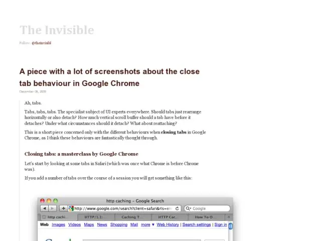
Basil Safwat does a very thorough comparison of the the tabs in Mac Safari and Chrome, pointing out the subtleties in the close button positioning and behavior. While Mac close icons are on the left by convention, Chrome positions them to the right of the tab and keeps them visible, while Safari positions them to the left and only displays the close icon on hover. I initially had to relearn the close button position because Firefox also places them on the right. Both handle tab resizing in a way that allows you to close multiple tabs while keeping the cursor in one position while clicking the close icon repeatedly.
Check out theinvisibl for the screenshots and complete deconstruction.
http://www.theinvisibl.com/news/2009/12/08/a-piece-with-a-lot-of-screenshots-about-the-close-tab-behaviour-in-google-chrome/
