I recently talked to someone about the graph/grid paper books I've acquired over the years which have become a central part of my process. This is a listing of those pads, and a telling of their virtues.
Rhodia
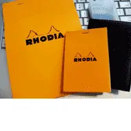
This is my workhorse. At first I didn't get why so many designers carried these around, until I got my hands on one. To me the Rhodias are an all-around notepad for in office or outside use. They're well constructed and durable. They have the nicest covers of all the notepads, so portability/carry-ability is what this notepad is about. The cover is hefty and scored so you can fold it back and out of the way. I sometimes dislike the violet hue of the gridlines and paper.
A5 is my basic sketch pad. I do thumbnail sketches on it before doing a detailed version on my letter-sized graph paper. It's reasonably priced considering the quality.
A7 is always with me. I carry the one you see above with the black leather cover in my back pocket. I abolutely love this notepad. It has even doubled as a wallet when I want to go out with nothing else with me but my Rhodia and a mechanical pencil.
Load up on Rhodia at better stationery and art stores or online at Exalair.
Moleskine
Like many UX people, I have loved Moleskine for years. But I stopped carrying around the lined and sketch books because they were bulky. I have so many of these laying around now because I've picked up quite a few from event swag bags.
The beige Cahier is another story altogether. I love the warm color of the paper and the fact that leaves are perforated. The weight is right for sketches, almost analogous to using newsprint or butcher sheets when warming up. It got a little costly for me to keep buying these though. I used to go through a Cahier pretty quickly. Maybe because the texture of the paper reminded me of newsprint and I used it for jotting down everything on it. I keep a few around the house because I love them so for their multi-purpose qualities.
You can get your hands on a Moleskine Cahier at stationery and art stores in every civilized city on the planet or via the Moleskine store.
Behance dot grid
Behance makes cool business-oriented notepads for their "Action Method" concept, which seems sort of like a lightweight GTD for creatives, or more specifically for design meetings.
I got my first Behance Action Method notepad from a design director who had no use for it. I use the back side of an action pad for its dot grid. I love the design of both sides and the colors used. The design is thoughtful and elegant. Sometimes I love the dots. Other times I feel like lines work better for me when I'm doing more rigid drawing. It's great for sketching and the weight is nice. You can buy a gummed edge notepad drilled for 3 hole binders or a spiral with perforations.
The spiral Dot Grid book also looks good. It's got a rigid cover, a squarish shape at 9 x 10.5", and is perforated.
You can acquire Behance goodness at the Behance Outfitter.
Tufte Graph
After I went to Tufte's seminar in 2000, I snatched up a bunch of letter and tabloid notepads. My Tufte paper ran out years ago, except for a single tabloid pad I use on special occassions. I loved the color and weight of the grid lines, and the weight of the paper.
Get your Tufte on here by scrolling down to the bottom of the posters page. Guess they couldn't be bothered giving the pads their own page. ;)
That's the list of past and present loved notepads and notebooks. Would love to hear what you use now, what you've used in the past, and what you loved or hated about using them in your daily UX work.