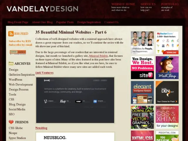
I'm enjoying the 6 part collection of minimalist designs posted by Vandelay Design. Some sites are more minimalist than others. I tend to use that term loosely at times as well. But the predominant theme seems to be type as interface, minimal use of graphics (aside from a logo and the body content), few if any graphic treatments of navigation, and little to no use of texture and graphic effects, and liberal use of white space.
http://vandelaydesign.com/blog/galleries/35-beautiful-minimal-websites/
