About 10 years ago I participated in the daily indexing of news articles as part of my job designing a digital library. During graduate study for the MLS my concentration was actually on information retrieval and classification, so I was interested in doing the job and understanding the content in order to know how to make it useful to users. Customers would get this information via the web site, by email, and in newsletters. Every day I had a bunch of news articles from a load of database feeds queued up for me to skim and tag. A first pass of auto-indexing and clustering was done and we'd have to check the applied tags and add new tags for subject, company, product, etc. We had a person whose primary job it was to maintain these terms, with the cooperation of subject matter experts in the business, in separate controlled vocabularies.
That faceted approach to indexing and description has really informed a lot of what I've done as a blogger in the years that I've maintained sites at iaslash, urlgreyhot, and now here. You see the result of the faceted approach to tagging in the metadata for every entry, and in the navigation for things like Design Tags and Design Colors. But I've hidden some of that tagging until I had some time to add views for navigating via those facets. I've been operating this blog with the mantra, "... better to get it up fast and fix it later."
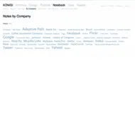
But now I've added a few more facets to the navigation. If you notice the subnav in the Interface, Design, and Notebooks sections, you will see that there are now options to browse by Companies in all of them, and additionally by Person in Notebook. So now you can view only Nike Interfaces or alternatively only Nike Designs, for instance. Also, in the entry metadata, the term Nike will appear in the pill shaped tag, and you can click that link to see all Nike tagged items across all sections of the site.
Just to give you an idea of how these tags get into each entry, have a look at the article editor below, and you'll see how granular I get with my tagging. I think it's probably much more than you'll find in a typical blog. Aside from the title, every field you see below is a taxonomy field expanded in the categories (ugh, I hate that they changed the label) area.

I believe over time this will provide a more complete picture around the experiences with each of the sites that I'm choosing to feature here. There are quite a few features in my roadmap for this site that just take time to implement. I will for instance find a way to segregate views by product rather than merely by company, so you can view only GMail UIs and not all Google UIs. Rest-assured, those tags are already baked in, but you won't be able to see them until later. Some of these and other useful features that made me want to create this site are forthcoming. Now that I've spent some months understanding what I like to do here, the volume may decrease slightly so I can focus on quality and providing more analysis. As always I welcome suggestions.
Drupal users may also expect that sometime in the future I'll expose more about the process used to put this site together, especially regarding how the taxonomy bits are being utilized. Thanks for continuing to stay with me as I explore these ideas.
