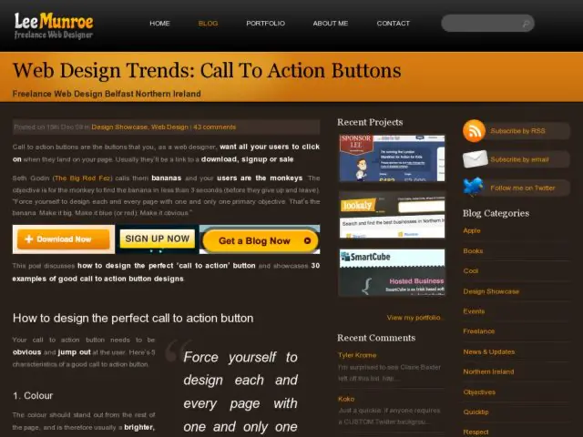
Lee Munroe has collected a slew of examples of Signup and Download call to action buttons that exemplify good CTA button design. He has 4 criteria for designing a good call to action button, involving the appropriate use of color, language, size, and white space around the button.
http://www.leemunroe.com/web-design-trends-call-to-action-signup-download-buttons/
