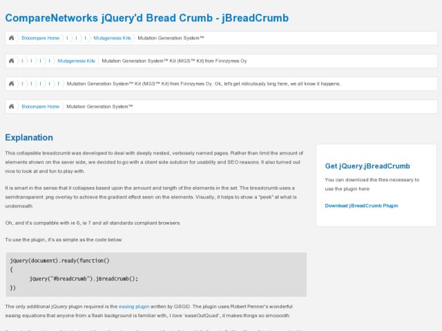
The JQuery'd Breadcrumb is an odd breadcrumb interface that collapses all nodes in the branch upon page load, and then expands to show each node the user mouses over. Their explanation:
This collapsible breadcrumb was developed to deal with deeply nested, verbosely named pages. Rather than limit the amount of elements shown on the sever side, we decided to go with a client side solution for usability and SEO reasons.
I don't see how this is a usability improvement over an exposed breadcrumb. If they needed/wanted to use breadcrumbs for whatever reason, it would seem more usable to show a larger truncated portion of each string with an elipsis, and expose the string on hover, rather than just show these strange portions of the string. I don't even see the whole first character, so it just looks kind of broken in a way.
I like the attempt to do something about minimizing breadcrumbs in deep paths. But it might even be more useful to use something like the path control we're accustomed to in the Finder and Windows Explorer. You'd have to do a lot to make it look less like a form control to make it unobtrusive, but provide some context. Do it with ULs and CSS, and I think you'd still be ok with regard to SEO, although someone might correct me if I'm wrong. I don't know why you'd allow horrendously long titles as in their example, but clearly you don't need to have the current node in the branch visible if the point is to minimize the weight of this UI element.
http://www.comparenetworks.com/developers/jqueryplugins/jbreadcrumb.html