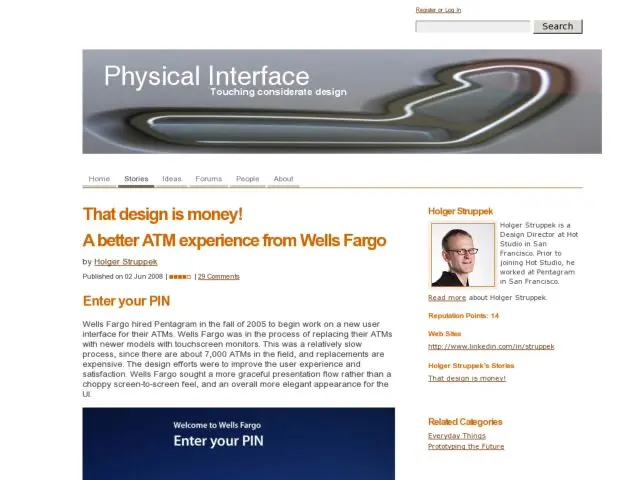
Holger Struppek has written an article describing the design and prototyping process for the redesign of the Wells Fargo ATM user interface by Pentagram. This is a rare, in-depth look at the prototyping process for an interface that we come into contact regularly.
The agency was contracted to abandon the prior touch screen/solid state UI, and transform the software to work with touch screen interfaces only and improve flow and visual design. There's some discussion of research considerations (environment, check scanning concerns), and excellent description of the design choices for button design, layout, and behavior, including the smart shortcut feature, which acts as a history-based shortcuts area for frequently-used features, and a deep look at the check deposit flow. I also appreciated the description of the physical factors of ATM screens and environments that affected contrast and positioning of controls.
