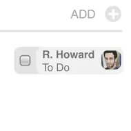
In Twitter today, I posted a message that I need to resist putting rounded corners on boxes in wireframes. Then I got a few replies essentially saying that stylized elements shouldn't be in wireframes. Context is everything. Taken out of context, it is very difficult to possibly critique a specific design technique without knowing the how and why you're using it. Because of that 140 character constraint in Twitter, I didn't really explain that this rounded corner example came from my hybrid high-fidelity wireframing and visual design document I was working on.
The above is an element in a wireframe. It's for a special kind of tag in Traction, the product I've been working on. They're for todo tags actually, and the element also doubles as a checkbox. If you click the checkbox, the To Do becomes a Done tag.
I'm only posting this entry now so people understand just what the hell I'm talking about in Twitter, and get the bigger picture with regard to what I've been playing at, with going from sketches to UI specs, because very often I skip the rough wireframe stage these days, and go right to design comp-quality elements in UI specs.
I wireframe fast. Faster than I work in Illustrator or Photoshop. I also do all of our XHTML/CSS. But it's still a hell of a lot faster for me to illustrate something in OmniGraffle. That's its purpose after all--it's a drawing program. It's for illustrating. Maybe it's static and it doesn't illustrate everything well, but when I need interactivity, then I do it some other way. But there are times when I find it does a hell of a job at illustrating visual design too.
My point is that there is a place for doing high fidelity in wireframes. The outie/innie distinction is good to point out here. In my situation, HiFi serves a purpose because I'm the one who goes from pencil sketch to implementation just short of hooking up the back end system functionality and AJAX. There are parts we do that go from sketch to implementation, or from discussion to implementation. But there are definitely parts where I do a HiFi wireframe because it's a more efficient path. 99% of the time, I'm not specifying/presenting to communicate an idea to a customer/client, I'm creating to both test out an idea with a design/dev team and to prep the way for graphic production on a visual design that's already been approved.
This discussion may seem out of left field, but it's something I do pretty regularly actually--go from Lo Fi at the onset of a project, to doing Hi Fi when visual design is there. So what's your take. Do you have a similar experience or treat wireframes differently than the majority of IA/IXD pros out there?