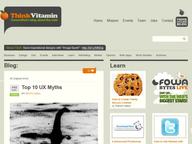
Keith Lang, co-founder of plasq.com, wrote a fantastic article for Think Vitamin about UX Myths. It's full of references and examples debunking stuff we hear repeated enough times that they begin to go unquestioned.
The top 10 UX myth list:
- The Design Has to be Original
- People Read
- People Know What They Like
- Design Always with Implementation in Mind
- Can’t Decide? Make it a Preference
- If you Have Great Search, You Don’t Need Great Information Architecture
- UX Design Stops at the Edges of the Product
- Design to Avoid Clicks
- People Don’t Change
- If the Design is a Good One, You Don’t Need to Test It
Some of these become so ingrained, that it takes a lot of effort to convince clients or colleagues otherwise. I've struggled with many of these beliefs, holdig on to some of the earlier in my career, e.g. I remember heated debates about and broad versus deep and the number of click to get to destinations. I struggle with #2 people read, and #5 preferences and handling options. Those can be huge challenges when you're looking for ways to simplify existing software.
There are so many nuggets here to be appreciated, and a few observations in UIs that I wasn't aware of. Check it out. If any of the references are new, you'll be surfing off the links for days.
