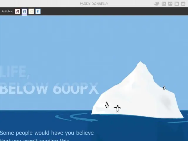
Paddy Donnelly flips the bird at the fold.
What I'm proposing is for you to think twice about these ‘rules’ which are preached so often around the web and aim to create something original. Don't live in the old world of pushing all your quality content on the visitor at once because they've only got 4 seconds before their attention drops (or whatever other statistic is doing the rounds at present).Think about the ultimate journey you want them to take. Entice them in, make them actively want to scroll and read on, and on, and on. Guide them with your excellent content and let them explore your site. Tell a story with your content. Space it out a little and you will have some happy visitors who actually want to be there!
A very fitting word to describe the state of web design at present would be
‘Samey’
So many sites have the same, big header, big fat call to action buttons, a sidebar, a big fat footer and the letterpress effect scattered about. Finding a bit of originality in the sea of sameyness is pretty difficult these days.
