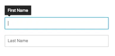
Jackson Fox and Jeremy Fields did an excellent 2-part write on the use of "infield" labels at Viget. There are several techniques for placing labels inside the input box. For varying reasons we may want to avoid the label on top or side positioning, but as Jackson points out, the infield placement can be problematic.

Part 1 talks about the problems using infield labels. Part 2 shows how they deal with the problem by using a visible tooltip that doesn't obscure the input, with a jsFiddle snippet to play with the code. You can download the jquery plugin from Git.
http://viget.com/inspire/making-infield-form-labels-suck-less