Blog

MTV Networks: Which video ads work best?

CNet reports on an MTV Networks survey on the effectiveness of their video advertising formats.

"Project Inform," the MTV survey, found that a five-second-long "pre-roll" ad in advance of the clip, combined with ten seconds of a semi-transparent ad unit that takes up the lower third of the video (and starts about ten seconds in), makes up "both the most effective and the most audience-friendly ad product for short-form online video," according to a release.
MTVN calls this the "lower one-third product suite." It was tested against two other ad packages, the "sideloader," which combines the five-second pre-roll with an ad that rolls out of the side of the video window; and a traditional 30-second pre-roll before the ad.

So, obviously, that's a limited number of options and certainly doesn't reflect the full range of possibilities for online ads. But it was thorough: Project Inform ran consumer survey tests across about 50 million video streams on the Web properties for media brands like MTV, Comedy Central, and Nickelodeon.

There's also mention of Hulu's success last year of providing users the option of viewing longer pre-video ads rather than interrupting their video. You can read the MTV article here.

http://news.cnet.com/8301-1023_3-10287132-93.html?part=rss&subj=news&tag=2547-1_3-0-20

You should follow me on Twitter: Dustin Curtis experiments with call to action

Dustin Curtis did an interesting experiment with a short call to action at the bottom of his pages, asking users to follow him on Twitter. Comparing the results shows that direct, but informally worded calls to action, and (ugh) using a literal call out like the word "here" had a pretty significant impact.

As the forcefulness and personal identifiability of the phrase increased, the number of clicks likewise increased. "You" identifies the reader directly, "should" implies an obligation, and "follow me on twitter" is a direct command. Moving the link to a literal callout "here" provides a clear location for clicking. I tried other permutations that dulled the command, used the word "please" in place of "should" and made the whole sentence a link. None of them performed as well as the final sentence.

At the very least, the data show that users seem to have less control over their actions than they might think, and that web designers and developers have huge leeway for using language to nudge users through an experience.

Would you come to the same conclusions? Read the complete article here. ;)

http://dustincurtis.com/you_should_follow_me_on_twitter.html

Don't Forget Heuristics

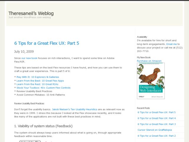
Theresa Neil continues her tips for designing great Flex UX's showcasing interfaces that exemplify Jakob Nielsen's 10 usability heuristics.

Don’t forget the usability basics. Jakob Nielsen’s Ten Usability Heuristics are as relevant now as they were in 1999. I stress this because I looked at the Flex showcase recently, and it looks like many of the applications are not built with these best practices in mind.

Read more at Theresa Neil's blog.

http://theresaneil.wordpress.com/2009/07/10/6-tips-for-a-great-flex-ux-part-5/