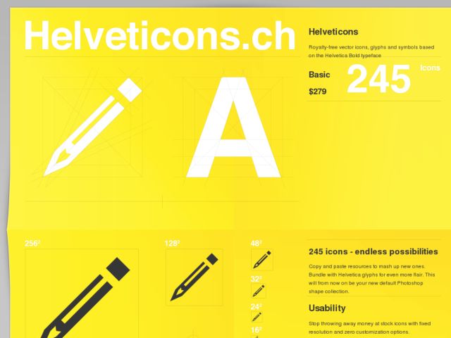
Helveticons are royalty-free vector icons, glyphs and symbols based on the Helvetica Bold typeface.
Blog
Infographics: Examples of Design-Enhanced Data
Jim Basio of Viget shows off a collection of his favorite Infographics.
Redub Designs a Better Online Magazine
I came across Redub's "Don't Make Me Scroll" presentation embedded above, which looks at the current offering of magazine readers which are modeled after print layouts, are difficult to read, SEO-unfriendly, and which rarely use the full capabilities provided by web browsers, e.g. multi-media. Or they're modeled largely after blogs with articles are long and scrolling, are limited by the possibilities of HTML/CSS, and have layouts that aren't differentiated from blogs and which pale in comparison to the layout in the printed version of the original magazine article.
Redub is working on a magazine reader, built on Flash, with a keyboard-enabled UI (input devices work as well) that scales to any screen size, does not scroll, and provides designer-friendly layout possiblities. You can check out the GOOD magazine demo to experience the reader. There's some really interesting interface design happening there including unobtrusive menus and prev/next paging controls, a pagination bar that is scaled to indicate the amount of content on the page, great examples of interactive media in the content, e.g. interactive charts, and hints at personal options like annotations. It's very well thought-out and works better for reading magazines than any of the readers out there.
It seems like they're trying to do for online magazine reading what the Kindle does for ebooks. Exciting stuff to see the full potential of Flash being utilized to improve the magazine reading experience, rather than just port it over to an digital, PDF-like version that doesn't work as well on screen.

