Joshua Porter's "Designing for Sign Up" presentation from Webstock, 2009, does a great job of focusing the task of sign up on user motivation and anxiety, and thinking through scenarios that help remove barriers to entry. As he says, the form itself is the least of your concerns. Porter describes the entire experience leading up to the call to action, providing excellent examples that ease users into sign up.
Blog
Dan Klyn interview with Richard Saul Wurman
IA instructor and author of the forthcoming book "Now That I See It" interviewed Richard Saul Wurman to discuss architecture and design, IA roots in library and information work, and the work of making the complex clear.
One thing that I latched onto is Wurman's contention that his success working with the design of information systems and structures comes as a result of acknowledging his ignorance. "Grasp your life as an ignorant person," he says. Most of us, in our arrogance are unwilling to do that. He also notes that the importance of doing this was selfishly motivated by his desire to explore and find patterns that help with this need for making things clear, but it starts with acknowledging this knowledge gap.
This idea resonates with me largely because that's how I feel approaching new projects every time, and that's why this blog exists--Konigi means "to make known"--to find what others have shared, understand them, and share that knowledge. Secondly, it seems similar to what Paula Scher discusses in her TED talk about ignorance--that the ignorance of the new is what has led her to her most innovative moments. There's something powerful in that idea shared by these exemplars of design.
Check out Klyn's blog for the full interview.
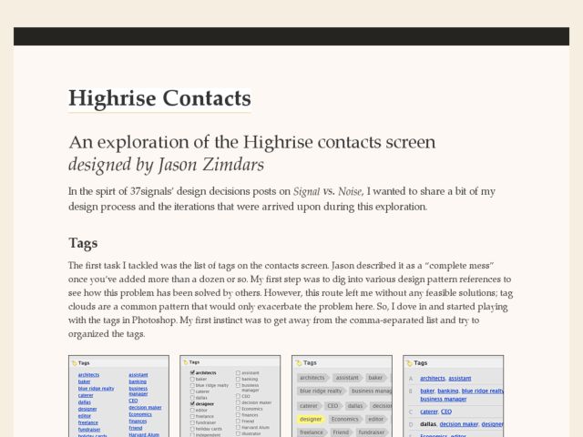
Highrise Contacts Design Exploration
Jason Zimdars describes the explorations and iterations over 37 Signals' Highrise CRM application. There's some nice description of the decision making process to arrive at modifications to the UI that clean up the use of tags clouds, organize listings of contacts, and attention to details around type and proportion.
