Blog

The Value of Paper Prototyping

Christian Watson discusses how he uses paper prototypes, showing a photo of a recent project he worked on.

Rather than sketch the whole page on a sheet of paper, I prefer to draw out the various components of the page, cut them out, and Blu-Tack them to the paper. This makes it easy to change different elements, switch them around, etc, without having to redraw the whole page each time.

Sketching out and adding individual components in this way enabled me to quickly come up with a general template layout. I then went back to particular features about which I had more concrete ideas and drew them out in more detail.

...

Another really helpful feature of paper prototypes — as long as you have them visibly attached to your wall — is that you get to look at them every day. I found this to be invaluable for letting the wireframe 'sink in' so that I could view it and review it multiple times a day and make sure that I was happy with it.

Can't agree more about the benefit of having them taped up to the walls too look at every day. I do this with everything and it helps to see things out of the corner of my eye, or from a distance with some regularity. It's a way of "living with" ideas, in order to assess their usefulness over time.

While I was reading this, I ended up searching for photos of my own paper prototypes and found this photo I took of a paper prototype I worked on a few years ago. I remember also enjoying the act of taping vellum modules to pages and moving them around with teams and test participants. I think it also feels more fun and participative working with disposable ideas that way.

http://www.smileycat.com/miaow/archives/001561.php

AlternativeTo: App comparison site may be useful for competitive research

AlternativeTo might be an interesting tool when doing competitive research. The new site describes itself as a a way to find better Windows, Mac, Linux and online applications by submitting the app you want to replace. It's a community site that relies on user submissions, so the number of alternatives is limited in some areas. Having a look at the Basecamp alternatives, for instance, only shows MS Project and the RedMine web app when I looked. But more popular app suggestions are abundant, e.g. alternatives to MS Word.

This could be a good resource with time for collecting examples to reference when doing a competitive study for a web app. One to watch.

http://alternativeto.net/

Should Design Be Held Back by a Tyranny of Data

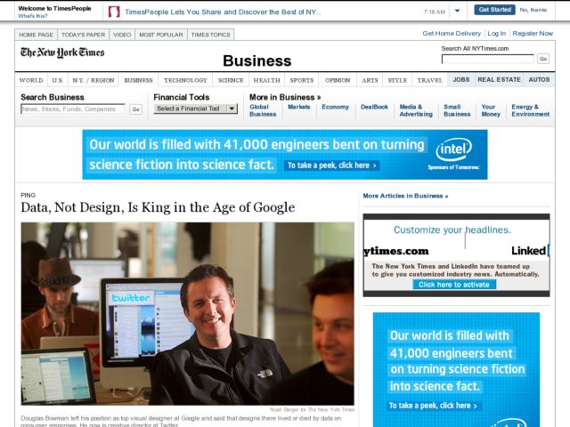
The NYTimes interviewed Doug Bowman to talk about his departure from Google, which Bowman wrote about on his blog in March. Bowman came onto Google as their first Visual Designer 3 years ago, and left in March. Some quotes from the article:

Bowman on Google:

“Data eventually becomes a crutch for every decision, paralyzing the company and preventing it from making any daring design decisions,”

Bowman on Twitter, where he is now Creative Director:

He has also found a new way to listen to customers: reading their tweets in reaction to the new design features.

“Using data is fundamental to what we do,” Mr. Bowman said. “But we take all that with a grain of salt. Anytime you make design changes, the most vocal people are the ones who dislike what you’ve done. We don’t just throw the numbers in a spreadsheet.”

Deborah Dunn, associate professor at the Stanford Institute of Design:

Adhering too rigidly to a design philosophy guided by “Web analytics,” Ms. Dunn said, “makes it very difficult to take bold leaps.”

“It is more from engaging with users, watching what they do, understanding their pain points, that you get big leaps in design,” Ms. Dunn said.

http://www.nytimes.com/2009/05/10/business/10ping.html