Blog

Adaptive Path's Favorite Sketch Tools

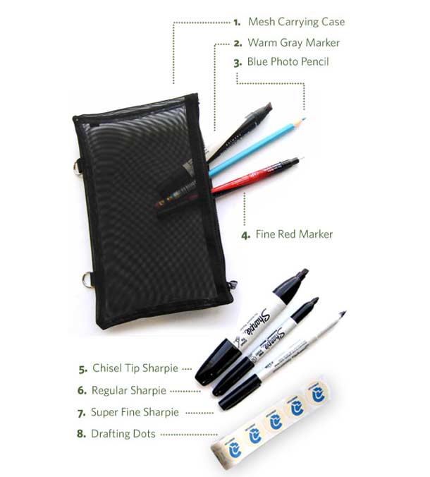
Leah Buley lists Adaptive Path's favorite sketch tools.

There’s an interesting shift happening in user experience design. After years of making documents that look like they are FEBE (for engineers, by engineers), we’re seeing increasing evidence of the human hand in our own work. Why are sketches and drawing suddenly so prevalent? Well, for one, they can save a lot of time and mitigate the risk of building the wrong thing. But we’re also finding that drawn elements magically invite people into the process and make ideas proliferate.

Whatever the reasons, sketching and drawing seem to be emerging as the next must-have skills for user experience professionals. If you’ve been wanting to beef up your sketching chops, this newsletter is for you. In it, I share my toolkit for sketching like a pro — even if you aren’t one.

Incidentally, I like the Pentel Sign Pen for thick lines and Microns for thinner lines rather than the Sharpie for sketchbook work, but for working big you can't beat the Sharpie. Great suggestions.

http://www.adaptivepath.com/ideas/newsletter/archives/031109/index.php
Chrome Experiments

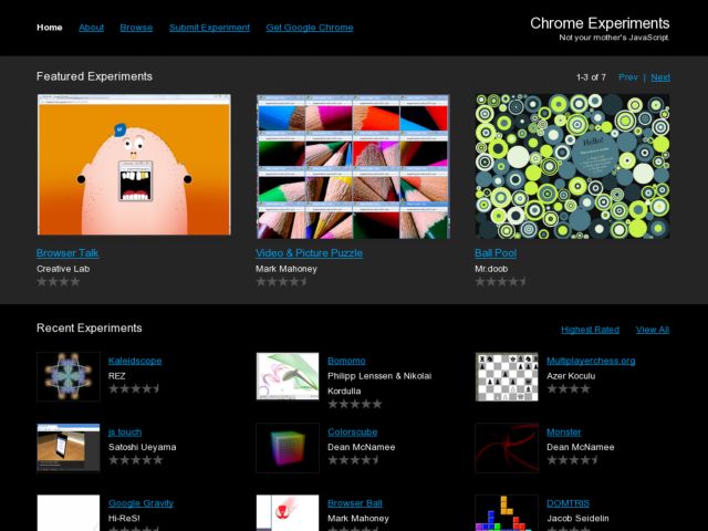
Google's Chrome Experiments lab showcases some interesting uses of Javascript.

We think JavaScript is awesome. We also think browsers are awesome. Indeed, when we talk about them, we say they are the cat's meow – which is an American expression meaning AWESOME.

In light of these deeply held beliefs, we created this site to showcase cool experiments for both JavaScript and web browsers.

These experiments were created by designers and programmers from around the world. Their work is making the web faster, more fun, and more open – the same spirit in which we built Google Chrome.

Some pretty slick stuff in there. Check it out. You won't need Chrome to play with these experiments.

http://www.chromeexperiments.com/

Fluid Grids

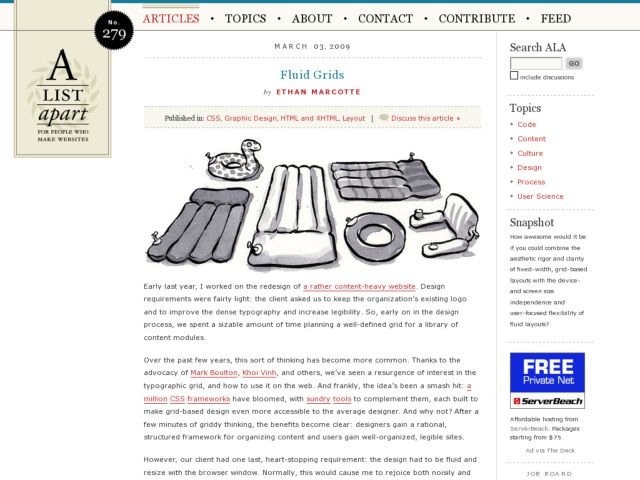
In the latest A List Apart, Airbag Industries' Ethan Marcotte writes about designing fluid grids, rather than using the fixed pixel methods provided by most CSS layout frameworks. Marcotte describes that the technique of calculating percentages for column widths is the same method we use for calculating font sizes in ems.

To calculate fluid grid dimensions, we first take a base font size of 100%, which is usually 16px in the majority of browsers when not altered by the user. This becomes our context variable. Then we take the fixed pixel size we want to make fluid, e.g. a width in our fixed pixel design, and divide by the context variable, which gives us a relative value for our fluid grid.

Fluid grid equation

target ÷ context = result

For example a 700px column is calculated to be 43.75em.

700 ÷ 16 = 43.75

The one minor exception to the above is that you might have to shave a pixel off your target if you experience problems with your widths in IE because of that browser's rounding behavior.

Users of 960gs may be interested in using the fluid port of that framework.

http://alistapart.com/articles/fluidgrids