I've been looking for ways to energize my creativity in between the longer stretches of time spent on difficult, routine, and less creative work. The thing that has been doing it for me lately is working with static html on some of my smaller production sites.
I was playing around with static html tools for a little side project I've been toying with. I was tinkering with Stacey and Kirby. Awesome tools for static PHP page building. I was also playing around with CodeKit, which looked like the most promising tool for little projects. But I figured it was all just playing and there wouldn't be a real static site project for me to work on for a while probably.
Then last month we launched UX Apprentice using WordPress. We were on a stable server that hosts some pretty massive sites, so I was happy. But then, as web hosts always do, it went down for a short period. Some rare issue on load balancers was the cause we were told. Downtime happens. But then while discussing this issue I said, "Fuckit. This site is so simple, let's make it static and put it on an S3 bucket."
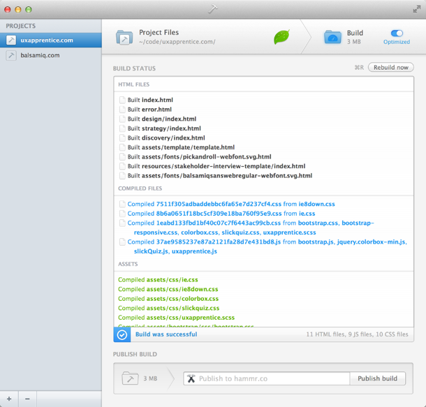
A week earlier I was playing with Hammer for Mac, the latest static site builder I had found. Among my options, including just doing it all by hand, this was the simplest of them all. I looked at what I would need to port the site to Amazon's S3 service for websites with no fuss. All I needed to do was suck the WordPress site down and convert it to static HTML.
I know this is small potatoes compared to the bigger things people are doing out there, but I got a kick out of doing this.
Here's how I did it, in case anyone out is considering doing the same:
1) Download
SiteSucker pulled the site down for me and converted it to static HTML. You can do it on the cheap with wget.
2) Create a Hammer Project
Look at your downloaded site, and clean out the cruft. Open Hammer for Mac and create your project. Open the source folder.
3) Organize files, use HTML editor to convert PHP to Hammer-smart stuff
I then moved my img, css, and js folders to the new project's assets/ folder. When Hammer builds, it reads your entire project and then knows where everything is so you can use the @path directive to reference files only by name, and include styles and css simply by name without paths using the @stlylesheet and @javascript directives. I cleaned all files up to use this.
I did the find/replace grunt work using Coda on my CSS and html files. Replaced the PHP that I use in my header to use the @include directive and the $title variable. My SCSS files got picked up and compiled with no problems. I then used the @path helper on images in my SCSS.
About two hours of this clean up and it built with no errors.

All my SCSS was compiled, my includes worked, and my CSS and JS were optimized (combined and minified).
4) Testing
I set up my hosts on my machine so I could test locally in the browser so all the TypeKit would work after I added that domain. I also learned that you can't test Typekit with a url using the file:/// protocol. Bummer. I already use VirtualHostX which makes simple work of managing multiple hosts on your local machine. It edits your httpd-vhosts.conf and hosts file. I had bought it originally because the web sharing option went away in OS X, and I'm too lazy to edit files just to turn PHP on.
Then of course, I tested on all my browsers and tested the responsive layout. We were ready to go.
5) Publish
Publishing on S3 is pretty simple. A normal person just needs to set up a bucket and use an S3 aware FTP app like Transmit and you're done. We ended up commiting it to a repository that is watched by a server that kicks off updates to S3 for pages that have changed.
That was the whole mini-relaunch that happened quietly after we launched UX Apprentice. We were live on WordPress for a week, and now we're hosted on an AWS instance and I expect the uptime will be awesome—as good as any S3 site. We do the same for our main balsamiq.com site and every time I see our blogs report downtime, I feel this wave of relief knowing our static pages on S3 are happily being pushed out without issue.
Anyhow, that made for an exciting day last week. It's energizing to feel frustrated by something and quickly turn something around that's better. And for anyone that's doing UX work that's looking for a decent HTML prototyping workflow and knows enough SASS and JS, Hammer may be the thing for you.


