Blog

The Language We Use

In "The language we use," David Malouf discusses how ideas about user interaction can become so ingrained in what we are familiar with, that our language begins to reflect that familiarity. That can lead to a natural tendency to explain away interaction without thought to what it means to the design of a thing. In this case a student describes the change of context in a sketch presentation by using the word "click" (as in clicks to go to the next screen). The absent minded use of the word "click" brings with it the connotations of a mouse click, and limits the possible set of interactions.

David makes two great observations here. First, that the way we talk about interaction design is as important as the visual elements of the design solutions we produce. The language we use, and in particular the selection of meaningful words that convey behaviors, and the intellectual content and analysis of our design is a closely bound component of what we're providing when we do design work. It is productive, therefore, to write about interactions (e.g. in your spec) and deconstruct what you write.

The second great observation David makes is that there is danger in the use of loaded language when it comes to describing interaction. Words like "click" explicitly point to the use of one type of input behavior, whether it's a mouse input or finger touch, that carry with it the limitations or constraints of that behavior. The same might be true of using certain conventions or design patterns. The use of a specific, familiar interface element, like a tab for instance, might lead to known but perhaps limiting behavior for a given application, that would hold the designer back from considering better alternatives for the interaction.

This discussion also reminds me of the thread started by Josh Kamler on "Designing by Writing." It is extremely valuable to engage in writing and discussion about design through deconstruction. Even in the absence of a studio environment, we can learn to analyze what we design by paying particular attention to how we describe what we've designed when we write specs and re-reading and deconstructing what we've written, and actively engaging in regular critique of our work.
http://davemalouf.com/?p=1560

OmniGraffle Sketch Stencils Now Available

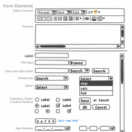
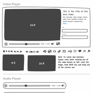
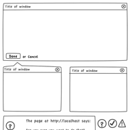
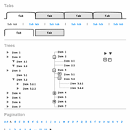
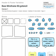
Sketches are often better tools for communicating designs than high fidelity illustrations or schematics. The purpose of the sketch style wireframe is to prevent the intended audience from thinking about visual design and focus on the functionality and behavior you are proposing.

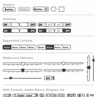
I'm happy to announce the release of this set of sketch stencils for OmniGraffle, based on the Wireframe Stencil. This set of user interface sketch stencils is designed for OmniGraffle 5.x. OG4 users are able to use the stencils by changing the .gstencil extensions to .graffle. The sketch kit contains all of the UI elements you'll find in the free Wireframe Stencils we provide at Konigi, plus additional shapes and elements to make it easier for you to adjust to this style of wireframing.

As usual, I'm sticking to the goal of keeping the tools on this site inexpensive or free. Your $10 purchase of this stencil set entitles you to free upgrades forever.


//konigi.com/store/product/omnigraffle-sketch-stencils

Untitled Document Syndrome

John Gruber laments the illogical, yet human, tendency to avoid saving new documents, which occasionally leads users to the loss of data when an "Untitled Document" is left in limbo and a crash leaves them scrambling to figure out what happened to it. The point is that users often can't be bothered with things like figuring out where to put this thing on a file system because we're too busy with the task at hand, e.g. writing the thing that we might not have a name or place for yet.

Good software would save users from their non-saving, human selves. Software needs to offer a way to protect us from our laziness (and I say that as someone who is very lazy about certain things) by providing systematic methods for frictionless data protection and recovery. We're talking about the realm of usability principles that Jef Raskin wrote about, e.g. providing undos rather than dialogs for destructive actions.

Gruber also talks about the "i" apps' implicit handling of things like file system paths in iTunes and iPhoto, which take care of file organization for you, so you can just focus on things that makes sense to you, like albums and playlists, and let the system just do the file management for you in a logical manner. Gruber also writes of the autosave intelligence in apps like Stickies and BBEdit, which auto-save in the background unbeknownst to the user, and upon return from an abandoned session, data is back where she left it, in whatever state they left it in.

These are frictionless applications--those that lets users get to the main task that brought them to the app in the first place, e.g. writing, uploading photos and music, without having to think of things like the file system. This is design for use, and not for micro-managing control. It's getting directly to the point of using the application, and avoiding obstacles like thinking about how to use the application.

I think this is the vision most of us, concerned with ease of use, espouse and want for our apps. I speak out of both sides of my mouth sometimes, opting for micro-managing some things, e.g. I've used a photo management app based on my camera/year/ file organization rather than using iPhoto's file management, but I let iTunes manage all my music and video data. But the point is, most people probably don't want to micromanage that organization.

http://daringfireball.net/2009/02/untitled_document_syndrome