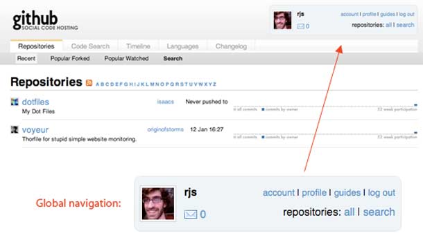
Ryan Singer posted a article on 37 Signals, deconstructing the design of the global navigation header on Github. In his example he points out the problem with the "Repositories: All | Search" links in the account box in the upper right of the screen, which suggests that those links are scoped to the user shown in the box.
This a great example of how visual grouping and proximity could be more effectively utilized to help users make sense of the available controls. Seems a bit strange to me that the Repositories link is in that area at all. Singer suggests moving the avatar to the right. I might even go further by moving the repository and search links to a different area or better defining the separation of those functions with the user information might be effective in this case. Removing the bounding box certainly helps to alleviate the perception of scoping created by the group, but a better visual structure could be represented here.
http://www.37signals.com/svn/posts/1524-distinguishing-decorative-from-meaningful-elements-in-ui-design


