Blog

Adaptive Path Aurora Concept Video, Part 1

Adaptive Path, as part of Mozilla Lab's concept video series, provides some suggestions for the possible future of the web experience with Aurora. This forward looking concept focuses on 4 high priority elements: context awareness, natural interaction, continuity, and multi-user applications.

The scenario laid out is one in which one user starts an audio chat and screen sharing sesion with another user and we begin to see how users can find information from their history and share it and remix it with others in the session.

Let's take a look at how they realized the experience hinging on those elements, in terms of the interface.

The radial menu

While browsing each object a radial menu can be summoned for acting on the object, e.g. getting the current version of a web page/object.

The spatial viewer

One of the ways they conceptualize contextual awareness is through browsing your history in the spatial viewer. This is a zoomable user interface in 3 dimensional space that presents the user's history in clustered objects, like galaxies in space. This is intended as an implicit clustering I assume, but could be based on explicit group since each cluster can also be explicitly labeled. The user may zoom back through history, with the z-index representing time.

The hand pointer and frame

The hand pointer is used to emphasize natural behaviors such as moving and touching things. The user can use the hand cursor to grab and drop objects around the spatial viewer to the outer edges of the interface. In the edges of the spatial interface is "The Frame." The Frame presents a shelf with shortcuts to history in these locations:

  • Top, shelf = frequently used objects
  • Left, history stack = recently used objects (reverse chron)
  • Right, user stack = temporary storage (reverse chron)
  • Bottom, wheel = objects I'm connected to right now

The wheel

The wheel is like the Mac Dock, but it's a rotating carousel with a fish eye lens focus. As you move through the wheel, related objects are highlighted in the spatial viewer.

Clusters

One of the biggest opportunities to extend the browsing experience, in my opinion, is to get the application to understand more about me and my behaviors and usage social patterns and give me feedback based on this. The spatial viewer attempts to address this.

The idea of monitoring behavior for implicit patterns and preferences is an area being tapped in discrete contexts, for example via recommendation engines on video, music sites, and in social spaces. I see this as suggestive of getting the application and service to take the ephemeral as well as the more deeply carved out patterns of my behavior, and use it all to remind me or to suggest to me those things that I am likely to have an interest in. It should do it based on all kinds of implicit attributes, like where I'm presently geographically located, what I've looked at, who I've connected with, as well as using those criteria I have explicitly described as important.

More to come...

The ideas here point to a promising evolution of our experience interacting with information. I'm looking forward to where else they see the browser going.
http://www.adaptivepath.com/aurora/

CSS Framework Roundup

Hidden Pixels recently rounded up the available CSS frameworks into a list. I happen to be evaluating CSS frameworks as well to find a flexible system to provide on a CMS I'm working on. The Hidden Pixels list isn't very descriptive of the specific usage or value each framework has to offer, so I've provided a summary of each to make this a useful reference when evaluating the list.

The CSS presentation frameworks listed below provide the underlying CSS structure for typical web site needs. The idea behind most of these is that they provide rules for the kinds of markup and layout web designers do repeatedly. They may supply grid systems and typography support, but not all of these provide both. Most provide at minimum an Eric Meyer style CSS reset. I've divided the lists into separate the frameworks providing support for grid-based customizable layouts from the other types of systems.

Frameworks supporting grid-based customizable layout

  • 960 Grid System
    Similar to Blueprint, but provides 12 and 16 column grids at 960px wide. 12 column grid is divided into portions that are 60 pixels wide. The 16 column grid consists of 40 pixel increments. Each column has 10 pixels of margin on the left and right, which create 20 pixel wide gutters between columns.
  • Blueprint
    Provides a 950px wide grid, with 24 columns spanning 30px, and a 10px margin between columns. Also provides a typography stylesheet with a baseline of 18px, allowing for alignment if every element uses a multiple of 18px.
  • BlueTrip
    Combines the grid system from Blueprint with the typography from Tripoli.
  • CleverCSS
    A Python script that allows you to use a sort of CSS shorthand to write your rules quickly without all of the characters required by CSS syntax. The script then converts your shorthand into valid CSS.
  • Emastic
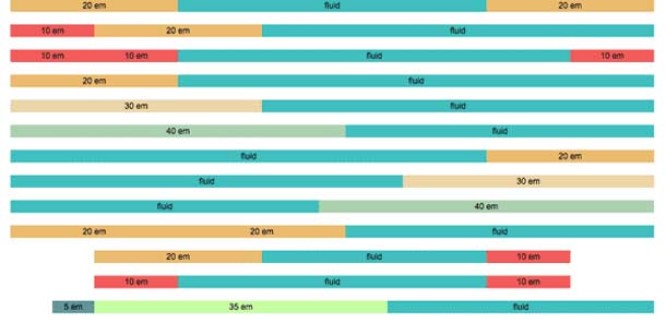
    A flexible framework, similar in concept to Blueprint, that uses ems for elastic layout. Allows you to achieve fixed pixel or fluid grids using ems, pixels, or percentages for column widths.
  • ESWAT
    File system framework for a simple site, including directories for the types of files you might want to use. Does not include grid or typography systems.
  • Logic
    A collection of CSS files and PHP utilities to generate layouts. Flexible framework providing support for elastic, em-based typography, and grids with ems, pixels, or percentages.
  • That Standards Guy
    Starts out as an apporach to call single style sheet within a Microsoft CMS. Pulls together various CSS libraries and hacks including YUI Grids.
  • Typogridphy
    Framework that uses the 960 Grid System for fixed or fluid layout, and provides typographic style rules for ‘creating vertical rhythm’, whereby all adjacent lines of text line up horizontally, regardless of line breaks and new paragraphs.
  • YUI Grids
    Yahoo's CSS Grids framework provides fixed and fluid layouts. Layouts are source-order independent, so your columns can be output in any order, regardless of the order in presentation. Grid accommodates IAB Ad Unit guidelines.

Related frameworks
These frameworks may provide either element support without layout rules or pre-configured layout options.

  • Boilerplate
    Based on Blueprint, but strips out Grid framework, so you'll have to write your own rules for columns.
  • Content With Style
    A quick-start framework, providing common names for div elements (e.g. header, content, main, sub, local, nav) and provides 6 different layouts.
  • Elements
    File system framework for a simple site, including directories for the types of files you might want to use. Includes specific prototype/scriptaculous and lightbox. Does not include grid or typography systems.
  • Schema
    Provides support for a 2 column layout with right sidebar. Layout options are minimal, but provides styles for standard HTML elements.
  • Tripoli
    Provides a base for creating dynamic layouts without interfering with typographic measurements. Includes rules for most commonly used HTML elements, and via a Layout plugin provides canned layout options.
  • WYMstyle
    Framework using layout modules. You import modules into a main stylesheet to achieve one of the core layouts provided in the library.
  • Yet Another Multicolumn Layout (YAML)
    Provides a fixed width and several multi-column layout options.

emastic CSS Framework

emastic is an interesting looking CSS Framework that is designed for both fixed and fluid layout. It looks like a nice alternative to fluid layouts than YUI Grids, with simpler and more flexible column structuring and class naming.

* Lightweight (compressed weight less then 4kb)
* Personalized width of the page in (em,px,%)
* Use of fixed and fluid columns in the grid.
* Elastic Layout with "em"s

Blueprint is going to have to catch up and produce a version for fluid layouts.

http://code.google.com/p/emastic/