Blog

Facebook Streamlining Application Authorization

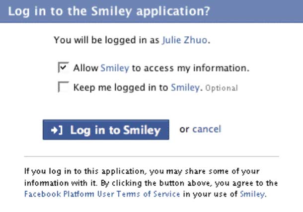
Facebook have announced to developers that they are going to remove the installation requirement screen and allow users to try an application before installing it. What this means is that users won't see the intimidating list of checkboxes to try an application out, and will get to install the application afterwards. This was meant as a preventative measure against spammy methods used by some applications.

The developer announcement described the migration to the new requirements.

When a user goes to an application for the first time and is prompted to log in, she will see a simpler screen, like in the screen shot here. Once a user authorizes your application, you can utilize all the API methods that access information about the user, publish stories to News Feed and Mini-Feed, and send the user notifications.

Above all, I like that this puts control in the hands of Facebook users. TechCrunch criticized Facebook for not taking stronger measures when dealing with app developers who use spammy methods, and argued that the method by which Facebook modifies the platform rules so drastically should concern the developer community. I agree on the point of making developers more accountable when they decide to play the evil game of deceiving users.

This seems like interesting news to me. Facebook are the Apple of social networking. That is to say, people watch very closely for the disruptive innovation they introduce and tend to react to that innovation, and we see it repeated in other social networking sites. I am thankful when the evolution moves in a direction that benefits user control and protection. Hopefully this means I'll see a huge reduction in the number of unwanted invitations to install crappy Facebook apps.
http://developers.facebook.com/news.php?blog=1&story=116

Marissa Mayer Talks at Google IO

Marissa Mayer, VP of search products and user experience at Google, discusses simplicity, the importance of testing and looking at statistics and data, the desire to look into the future and think about the long term, to solve impossible and everyday problems, and of course playing at what interests you. The event is blogged by Eloy Zuniger, Jr. and covered by Information Week.

Seems like a few old topics are discussed that I've read in past articles. In some cases, more pieces of some puzzles fell into place. I found one piece of the talk provided some interesting feedback on the impact of the minimal search page.

Mayer discussed the history of simplicity on the search page. In truth, simplicity as a principle was not what determined the spare design. Google didn't have a webmaster at the time and Sergey didn't do HTML. Mayer reported that the absence of a lot of content on the page had an odd side effect with users, which they observed in early testing.

InfoWeek reports Mayer saying, "[S]earchers would load the Google home page and wait for upwards of a minute in some cases. Asked why, the testers, accustomed to pages chock full of content, said they were waiting for the rest of the page to load. That's why Google.com has a copyright notice at the end of its home page, said Mayer, to indicate that the page has loaded and that searching can begin."

Is also interesting to read about the attitude different teams have taken to difficult problems, and how they try to improve the experience with everyday problems. Google Health, GOOG 411, and Ride Finder are great examples of that.

I find the Google approach to problem solving fascinating at a high level, because, they're looking at fundamental problems and are engineering solutions that affect every day life profoundly. When you think about it, this is the key thing, in my opinion that makes Google interesting&8212;the ability to look at problems we experience in the world, and think about how technology can be used beat a path to solutions, no matter how difficult the problem appears on the surface.

http://blog.eloyz.com/google-io-marissa-mayer-with-a-glimpse-under-the-hood-of-google

Measuring the Usability of Everyday Products

David Travis reports for UserFocus on "ISO 2082, Ease of Operation of Every Day Products." While web-focussed interaction designers and information architects may not be involved in the design of everyday products, we should probably be interested at a high level, in the processes discussed. As Travis points out, clients are increasingly concerned with objective measurements of usability, and standards such as this "...will help ensure that we have robust and reliable test methods for all interactive designs, whether these are products, software or web sites."

ISO2082 is a new standard for the measurement of usability in everyday products. The document provides requirements and recommendations for the design of easy-to-operate everyday products. Its intended audience includes usability specialists, ergonomists, product designers, interaction designers, product manufacturers, and others involved in the design and development of everyday products.

The document is organized into 4 parts:

  1. Design requirements for context of use and user characteristics.
  2. Test method for walk-up-and-use products.
  3. Test method for consumer products.
  4. Test method for the installation of consumer products.

As a designer of web products who only gets involved in discount usability testing, this standard is a curiosity to me more than anything. As Travis notes, testing consumer products is primarily concerned with determining if the product helps users achieve the most frequent and/or important user goal that the product is intended to support. So we're talking about tests of large groups over small sets of tasks in short periods of time. This is the kind of thing that is best handled by a dedicated usability team or consultant.

I think we designers, at minimimum need only be aware of the process proposed here, and the relevance this may have with regard to having a standardized process to reference with clients or usability consultants.

http://www.userfocus.co.uk/articles/ISO20282.html