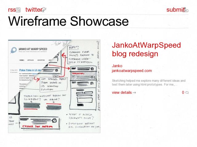
Mike Lohrman's Wireframe Showcase is a user-contributed wireframe and UI sketch gallery. I'm hoping, since there is some space on the individual pages for content, that we'll see a little more discussion about process and design thinking here rather than mere visuals of design artifacts. It's always good to see more people showing how they explore ideas with sketches and wireframes.
Blog
Sketching with the iClooly Stylus
A few days ago, when I thought of hacking my Pogo Sketch, I started researching all of the options for creating my own drawing tool for the iPad's capacitive touch screen, and was researching the styli that were available. I came across the odd design of the iClooly and thought I'd try it out of curiosity.
I had low expectations, but was surprised by how well it works for iPad sketching. I did the quick character sketch above in about 5 minutes with the odd little iClooly and Sketchbook Pro. As usual, there are things I think could be designed better, but this seems the ideal solution for my iPad sketching needs. The pros and cons follow.
The iClooly is manufactured in Korea and is not the prettiest looking or most ergonomic stylus. The drawing tip is actually a brush. A cap covers the tip, and a button at the end of the metal cylinder must be depressed to push out the soft metal bristles. It actually resembles a makeup brush.
First I'll touch on the things I dislike. Like most touch styli out there, it's barely long enough to fit in your hand--I find myself keeping my fingers higher above the screen on an iPad than I would a normal pen or Wacom stylus to avoid making marks. The cylinder is quite thin, so those with big fingers that detest thin pens be warned. The cap comes with a little key ring, and must be removed to use the brush tip. Unfortunately, it can't be attached to the back of the pen. One thing I also worry about is how the bristles will hold up. I'm imagining that they'll be splayed out with repeated use, like a well-worn toothbrush. Time will tell.
Now I'll cover the pros, starting with the form factor. I'm used to using thin pens that I get occasionally from Japanese stationery stores, so the form factor doesn't bother me, and I like the fact that it has a clip to attach it to the outside of my Apple iPad cover. The metal cylinder feels durable.
Where this stylus really shines is in how it performs as a drawing tool. At first I thought it would be weird drawing with a brush, but it is not at all. Once I let go of the idea of needing a fine point to sketch, I've been able to evaluate these things a little more practically. The broad brush is not much thicker than a pencil eraser, and if you move fluidly on the screen it's possible to let the physical size of the tip disappear and focus on getting your idea down.
The main reason this stylus beats the others, in my opinion, is because the brush tip glides across the screen effortlessly. The quick test at drawing UI shapes in Sketchbook Pro below shows how lines can be smoothly drawn, without any of the ugly jagged shapes I occasionally would get using a foam or rubber stylus tip, which tends to catch the glass and cause too much friction. That's why I had to hack my Pogo in the first place. This is why I loved Ideate at first--it makes up for the jagged line problem by smoothing your lines.
I should add that drawing finer details like the icons is really impossible for me without using a sketch app that lets you zoom like Sketchbook Pro does.
The last observation I have is that if you view sketching as something you do loosely, and give up on any of the things that make it feel more mechanical, i.e. straight and clean lines, grid backgrounds, it's easy to start feeling capable sketching on the iPad. I think in my quick test this kind of shows. The rougher and looser I draw, the easier it is for me to get out of my own way and not fuss on aesthetics. The Kirby character drawing I started above was fun and effortless and using the brush tip to airbrush color just felt awesome, better even than doing it with my Wacom.
I highly recommend this thing to iPad-toting interface designers that want to try their hand at getting creative with some of the better drawing apps out there. Tell me what you think and please post your sketches to the flickr iPad Sketch Group.
Hacking a Pogo Stylus for Smoother iPad Sketching
I blogged about what I thought could possibly make a better stylus recently and thought I'd sketch what I was thinking. The above picture shows how I think you could hack the Pogo Sketch stylus so it will glide a little more smoothly on the iPad screen. The capacitive foam creates a little too much friction to feel natural to me.
I drilled a small hole in the foam and inserted a plastic nib from an old pressure-sensitive screen stylus into the center. I then sawed off the back of the barrel and inserted a metal skewer into the back end to hold the nib in place.
The spring was actually part of the old stylus nib, and actually works well for adjusting the pressure when drawing--pressing hard makes the nib recede and the foam makes more contact.
The photo below shows what I ended up with.
Seems like a simple way to get past the problem of drag on the screen.


