Blog

Interaction Design Association Redesign

I've finally gotten around to checking out the Interaction Design Association (IXDA) site relaunch, which has been redesigned and migrated to the Drupal platform. The IXDA has one of the most impressive list archives for professional association that I've ever used, and the new features provided by this platform open up a host of new notification options. There are a few more browsing options in the discussion area, a resource library, and what looks like a redesigned job board.

Excellent work. Check it out if you haven't already.

http://www.ixda.org/

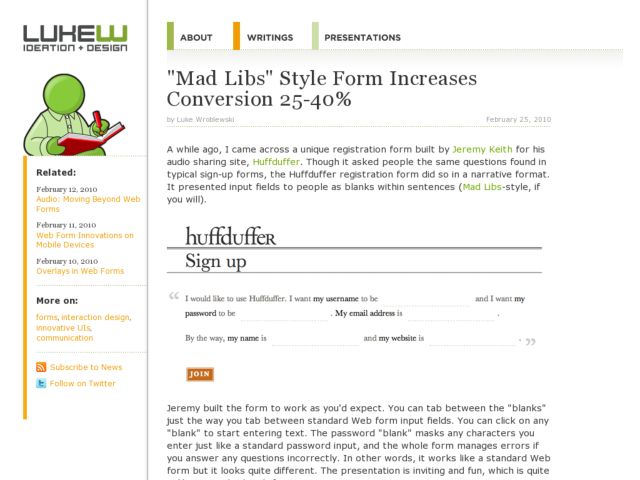
Mad Libs Style Form Increases Conversion 25-40%

Luke Wroblewski reports on A-B tests performed by Ron Kurti and the team at Vast.com, who note that Mad Libs style forms increased conversion across the board by 25-40%. Read more and see the before/after screenshots at LukeW.

Update:

Shortly after posting this, David Kaneda pointed out his post, in which he observes that there is quite a bit more to that Kelly Blue Book form redesign than just switching from vertically arranged fields to inline fields. The increase in conversion can't necessarily be attributed to one thing in this case since there are many other variables from A to B.

Patrick McKenzie noted that you should test with your own users. He experimented with inline form fields in his A-B test and found that conversion rates decreased. His form design, however, was a bit harder to parse than the KBB example. Some argue that the agenda there seemed to be to disprove the effectiveness of the mad libs style.

There's even more discussion about issues with the A-B test at Hacker News. So this looks like one to implement with care and be sure to observe the results.

For what it's worth, I find short inline forms to be effective, and useful given space constraints. The login form on this site, for instance works within a short strip of real estate. It's not really the same as the longer forms--the mad libs style seems to take about a paragraph rather than sentence--but it's similar in that it departs from the typical quick parsing of a skimmable columnar layout to prose style reading.

Konigi inline login form

http://www.lukew.com/ff/entry.asp?1007

Michael to Join Balsamiq

This is going to be big.

I've been keeping a secret for a few months, that I'm finally able to share with my friends and colleagues who follow Konigi. Today I'll be bringing my love of interface design to the small team at Balsamiq. I will be joining Peldi, Val, Marco, Luis, Mariah, and Malcolm, my new family at the company that introduced software and web designers to the fun and easy way to create quick, sketch-style wireframes with Balsamiq Mockups.

This move is the right change for me at the right time. I'll be able to marry my experience at working in-house on an evolving product, with my love of creating tools that advance my craft and sharing that knowledge and toolset with the UX design community. The move also represents the need at this point in my career to find a small group of passionate people that feel like family, that share my values, and that have a commitment to delivering a fun, simple product that people love to use.

I've communicated with Peldi off and on in the past few years. We actually made contact initially because we both wrote daddy blogs a while ago. Every time I've spoken to Peldi since, it feels like talking to a brother, and his enthusiasm is absolutely infectious. We've ended some Skype calls giving high fives on screen, which felt at once nerdy and totally awesome. He's a natural leader, and I respect his commitment to transparency and doing good. When I've chatted with Val, Marco, Luis, and Mariah in the past few months, I felt that same kind of warmth and enthusiasm, and I knew I found my home.

I can't wait to start doing the work. I think we can expect that I'll be working on the user experience for Mockups Desktop and the myBalsamiq web app. My goal is to support the team in continuing to improve the overall experience with Balsamiq products, from providing support and fielding customer needs to bringing rigor to the design of every product feature. There's a clear vision for simplicity and quality in this team, and I want to help fulfill that. This is going to be big, and as you can tell, I'm having a hard time containing my excitement.

Read Peldi's announcement on the Balsamiq. You can also follow my new Twitter identity, @balsamiqMike, for Balsamiq related UX tweets.

http://balsamiq.com