Blog

Usabilla Officially Launches

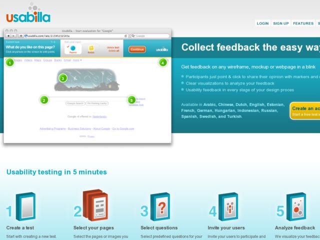
Remote usability testing service Usabilla has officially launched with tiered payment plans and PDF reports for all your test results. They will continue to provide a free service for up to 5 pages which lets you analyze the results of the first 25 participants of each test.

The Amsterdam based usability startup has been making impressive progress since their launch nearly six months ago. With the help of beta testers Usabilla have been able to build a useful tool to collect feedback on webpages, mockups, sketches, and other images. According to their press release, more then 2500 usability experts, web designers, online marketeers and other web professionals are using Usabilla to conduct remote usability tests and collect feedback.

I have been a beta user of Usabilla during their pre-release this year, and Usabilla is a Konigi sponsor.
http://usabilla.com/

HTML Prototyping Discussion Group

As you may know, I've been working on an html prototyping toolkit that's in its infancy, and available to play with in pre-release form here on Konigi. What you also may know is that I hope to put the code in a repository so that people can contribute UI component markup/css/js to it, but what I've got is not mature enough yet.

A few people have already started sharing their ideas and tips with me and I've felt like it's kind of a waste to have some of these discussions happen offline, so I want to step out and start these discussions in a wider venue.

I've created the HTML Prototyping Google group so that those of us who are interested in going deep on HTML wireframes or prototypes can talk about what we're doing and how we're doing it. Hopefully we'll give each other advice and find ways to learn new techniques or refine our craft. The group is NOT intended to focus on what I'm doing with the protokit, but is there for anyone who's using any method to do HTML prototyping. I will be there every day to monitor and participate.

I will look at every member that comes through this group and promise to try to keep the discussion on topic and keep flaming, trolls, spamming, and advertising from littering the list. So if you're interested, sign up and introduce yourself.

Let's go.

http://groups.google.com/group/htmlprototyping

About the close tab behaviour in Google Chrome

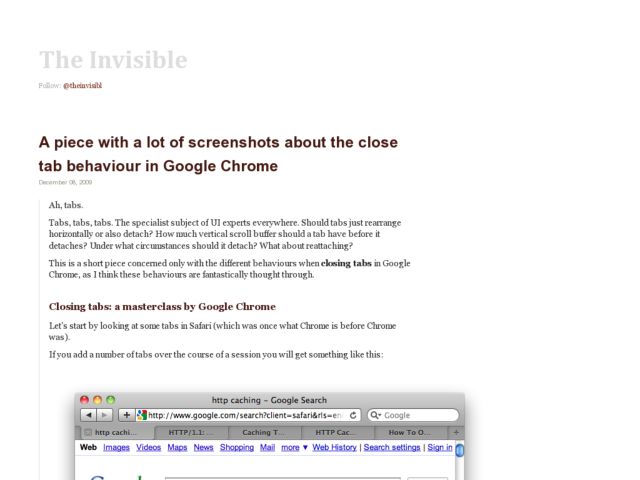
Basil Safwat does a very thorough comparison of the the tabs in Mac Safari and Chrome, pointing out the subtleties in the close button positioning and behavior. While Mac close icons are on the left by convention, Chrome positions them to the right of the tab and keeps them visible, while Safari positions them to the left and only displays the close icon on hover. I initially had to relearn the close button position because Firefox also places them on the right. Both handle tab resizing in a way that allows you to close multiple tabs while keeping the cursor in one position while clicking the close icon repeatedly.

Check out theinvisibl for the screenshots and complete deconstruction.

http://www.theinvisibl.com/news/2009/12/08/a-piece-with-a-lot-of-screenshots-about-the-close-tab-behaviour-in-google-chrome/