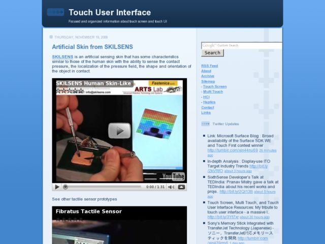
I just discovered Touch User Interface, a blog that reports regularly on touch interface projects, and provides links to resources related to designing for touch screen interfaces.
Blog
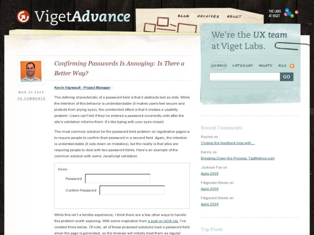
Confirming Passwords Is Annoying: Is There a Better Way?
This an article from March 09 by Kevin Vigneault of Viget that explores some techniques using Javascript to create more usable password inputs in forms. The ideas range from using a checkbox or button to temporarily show the password or changing type from text to password when the input is not in focus. Great ideas.
If you're interested in this topic, you might also want to check out Chris Dary's experiments with password masking.
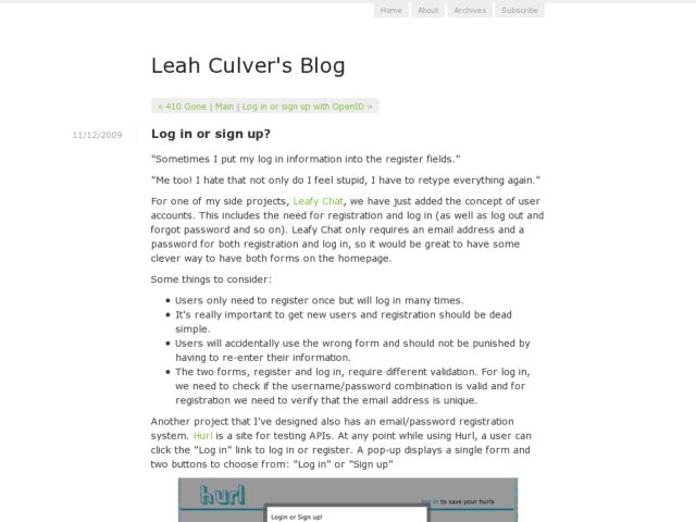
Log in or sign up?
Leah Culver discusses the design of hybrid sign up / login forms, showing a few examples and the final form as implemented for Leafy Chat. Uses the familiar I'm a customer/I'm new here radios that we know from Amazon, but positions it before the password field, which I find an improvement over the Amazon implementation. Lots of ideas in the comments.


