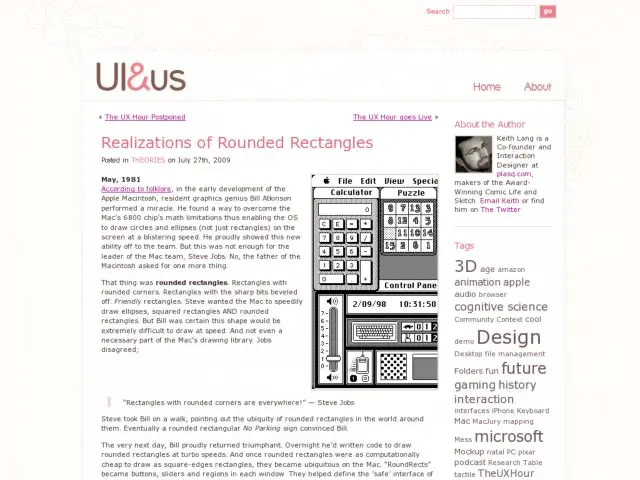
Plasq designer, Keith Lang, recounts the story from computer folklore of how the rounded rectangle came to dominate the Mac OS, and discusses its effect on visual cognition. He gets Professor Jürg Nänni, author of Visual Perception to offer his opinion.
A rectangle with sharp edges takes indeed a little bit more cognitive visible effort than for example an ellipse of the same size. Our “fovea-eye” is even faster in recording a circle. Edges involve additional neuronal image tools. The process is therefore slowed down.”
Professor Nänni is saying that rounded rectangles are literally easier on the eye. Put another way, compared to square-edged rectangles, rounded rectangles are more computationally efficient for the human brain. To me, this is a revelation. An idea that at the very least demands more investigation.
The comment by Voideka provides a perfect visual reading of the difference between the rounded and sharp angled shapes.
"...to me the difference I perceive is a single line versus four lines. In other words, when corners are involved, the brain processes from point A to B, then B to C, and so on, until it completes a circuit. With rounded corners, the line never comes to a point, which we interpret as a stop, and so there is a single computation following the entire shape.
I think the key is in thinking of a point as a full stop (much like a period in a sentence).
The point being made is that a particular use of shape, color, position, and movement are not simply aesthetic decisions, but can impact visual cognition. Mullet Sano's Designing Visual Interfaces is another good source for the kinds of principles that can be used in practice. I haven't read Nänni's book, but have read a lot of literature on visual literacy, and tend to like the argument, however subtle, about the impact of the rounded shape on effort and perception.
http://www.uiandus.com/2009/07/27/theories/realizations-of-rounded-rectangles/
