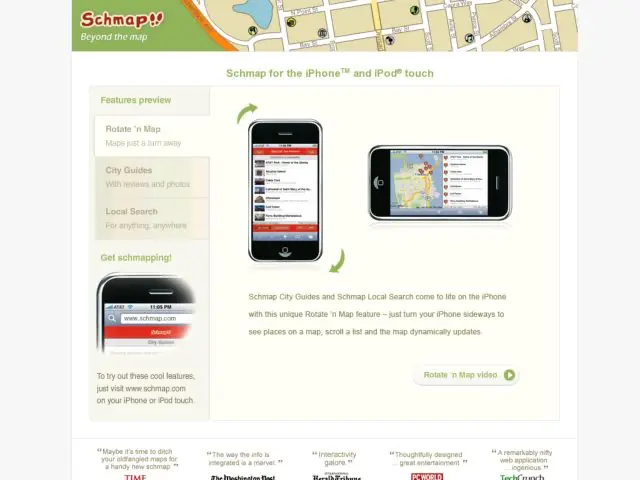
Schmap provides a local guide service for major cities. Listings are provided with general guide information, reviews, photos, and location on a map.
The iPhone service attempts to maximize the unique features of that device. Listings are simple lists with thumbnails, but if you rotate the phone to landscape orientation, the listings then display alongside a map with markers to show where each place is located. Rotating back returns to the list view. You can click on an item to view the detailed info. The info pages resemble address book entries in the iPhone.
Another different approach they've taken to displaying list views can be found in their pagination. The lists contain a footer pinned to the bottom of the window. You can either use Prev/Next buttons to page through, or perform a 2-fingered scroll to move through the list in smaller increments. This seems like a different sort of interaction that I haven't experienced before. Scrolling in the iPhone can be a bit strange because of the lack of feedback about length of page that a scrollbar provides. This type of interface is trying to provide combined scrolling and pagination.
Schmap is different in that it isn't just tacking an IUI front end to its service. I've tried their client application and their normal web site, and find that the iPhone application is quite a bit more pleasant to use and look at.
