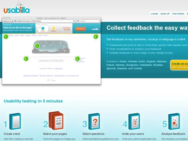
I've been watching Usabilla for some time now as a beta tester with the expectation of utilizing it on several projects. They've continued to make improvements to the app, with the help of our feedback. They've also posted new information on their site to familiarize users with their product. This is a review of my recent test with the latest revisions.
Creating Tests
The process is still quite simple: 1) Create a new test, 2) Add pages to test either from images you upload or using URLs, 3) Use the pre-defined tasks and add your own tasks, 4) Invite users to participate.

Test Session
I was initially drawn to Usabilla for it's 5 second test capabilities, but also wanted to the ability to do more with some screens, e.g. ask users to answer questions in addition to simply showing where they'd click to do something. They provide this with the "add note" function.
At the beginning of a test session, the app acquaints users with the controls they'll be using. The difference between points and notes is the one thing that I think could use more clarity. Even making the screen above call out, "This is a point" and "This is a note" more explicitly could serve as a sort of mini-tutorial to short-circuit any confusion and familiarize users even more before they start. I just wonder how much people actually read these things because when I started using Usabilla, it took me a few seconds to realize that I had to switch tools to use the annotation tool. It's very simple and straightforward once you get it, but I feel you have to be reminded that it's there.

I also thought that I might want a task to require users to answer a question with their click mark, so I wondered if it might be possible to provide only the annotation tool for some tasks. Or perhaps, the point tool could be accompanied with the annotation function? I'm not sure what would work best given all of the use cases, and would be careful of changes because what it does now is simple.
This is what it looks like to add points when completing a task/answering a question.

This is what it looks like when adding notes.

Usabilla does the simple stuff very well. The click to answer / point system works for me, and might be the best you can do with an unguided usability test. The annotation control has improved as well, and I think people who don't want to add notes will simply use the point control. But in my test session, there were a lot of responses made using annotations, so I find it more than adequate enough for most needs and a pretty elegant solution, given that these tests run on autopilot.
There are a lot of features being asked for in their GetSatisfaction page. Hopefully there's room for some of the features that are being asked about, e.g. can we test user flows by linking screens together or using linkage between live pages? I think these are great ideas, and if they figure out how to pull it off, it would be exciting to try.
I'd also be interested in some sort of light post-test survey functionality. That may be out of scope for Usabilla, but they provide a nice work-around in that the redirect URL at the end can be pointed to a survey.
The menubar shown in the test is another area that I hope will continue to improve, perhaps as a smaller, fixed bar. Again, the beauty of this tool is that it does a simple thing very well--gets feedback on screens using questions you ask. Asking for too much will mean harder work staying effective for that primary use case.
Analysis
After the test is complete, You can view results using the Analyze section. The pages tested are shown as thumbnails. Selecting a page displays tasks and allows you to select colors to display the click-point markers overlaid on your screen. Markers can be shown as points, clusters, and using heatmaps. Hovering over notes displays the note content.

I've provided some feedback suggesting improvements to the flow from Test tab to Analyze tab. Some minor things just need to be cleaned up to improve these interfaces for me, e.g. Analyze links from Test pages should go directly to the right page, Analysis page should use progressive disclosure, etc. Data from the results can also be exported as text.
Usabilla continues to improve with each version. They're listening to feedback and responding to feature requests. The promise of doing remote usability testing with a tool like Usabilla is not that it will replace formal usability testing. But it fills a gap by providing a service to those who want to do many small tests, e.g. 5 second test, or who only want a few questions answered.
You can try Usabilla for free.
[Disclaimer: After participating in the beta of Usabilla, the company have begun to sponsor this site.]
