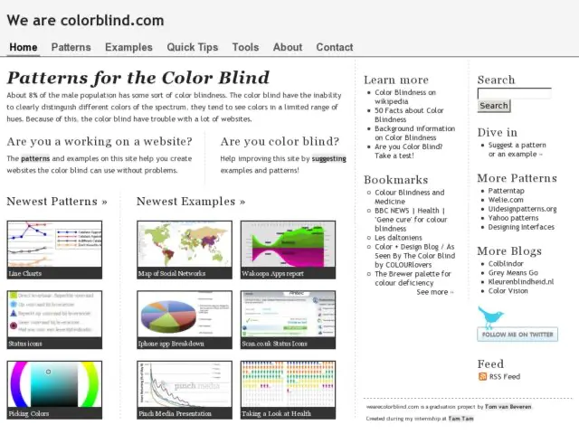
Wearecolorblind.com is a website about colorblindness created by Tom van Beveren. Van Beveren discusses good and bad examples of interfaces, charts and diagrams with respect to how they are viewed by color-blind users. He also provides patterns and suggestions for improving their accessibility.
Would be excellent to pass some of the examples through some of the simulators I recommend.
